04
Wi-Fi Planner Pro
One Wi-Fi heatmap that has to make sense for both a small office and a factory floor.
The deck is the original proposal, dated August 2025 — three months before the build began. The AI wall recognition on its core-flow slide is the piece that didn’t survive the schedule, and the last chapter is about that.
The 30-second version
- The problem
- The tool could calculate everything, but drawing felt like CAD, one wall took several steps, and shipped features were hard to find. Nothing could be calculated until every wall was drawn by hand.
- What we did
- As the only designer, I tested a first session with IT and R&D colleagues, cut the drawing frictions one by one, set a rule for what stays on screen, and chose a new heatmap colour scale.
- Result
- Shipped in three months. People around me report drawing and changing materials got easier. No before-and-after numbers.
My part
- Information design
- Interface design
- Heatmap visual system
Platforms
- Web
Team
- Solo — product direction, UX and UI
Client & timeline
- D-Link
- 2025.11 – 2026.01
Background
Powerful, but getting harder to learn
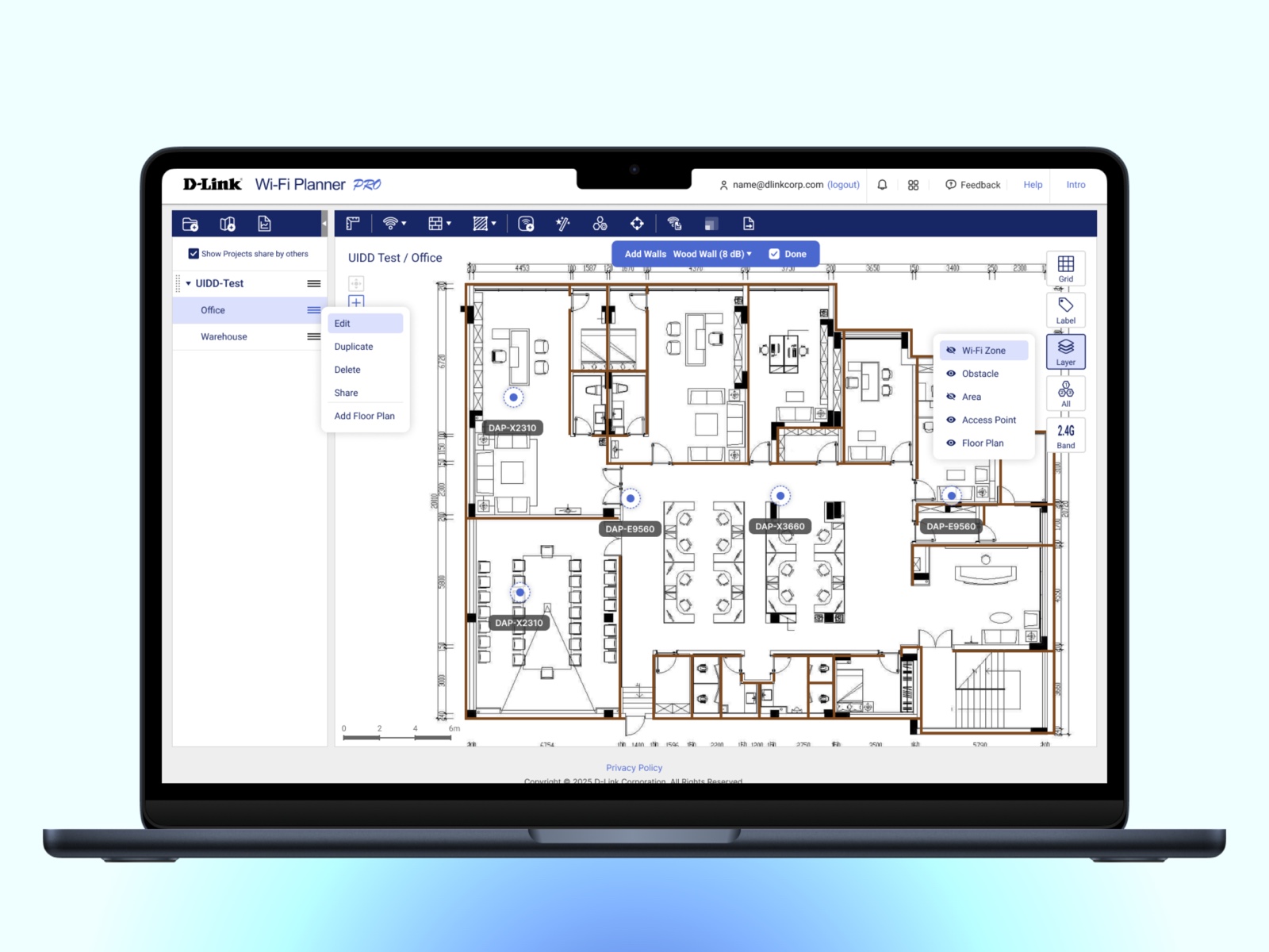
Wi-Fi Planner is an enterprise tool for planning wireless networks: model the space, predict coverage, and decide where access points go before anyone climbs a ladder. This was my last project at D-Link: three months, and I was the only designer.
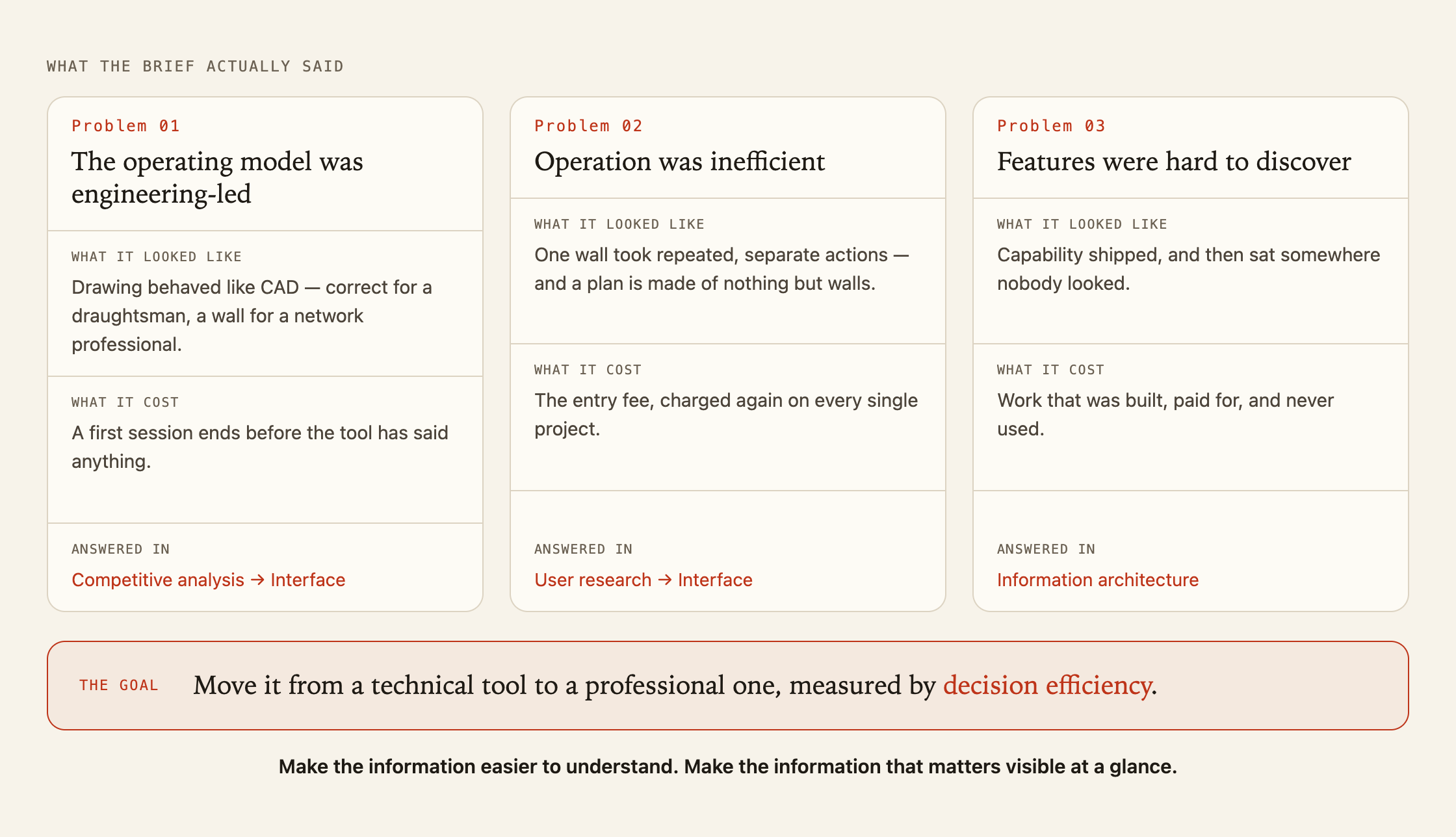
The brief named three problems:
- 3
- months
- 1
- designer, on product direction, UX and UI
- 1
Drawing behaved like CAD: fine for a draughtsman, a wall for a network professional.
- 2
One wall took several separate actions, and a plan is nothing but walls.
- 3
Features that had shipped were hard to find.
Competitors
The gap isn't accuracy
I compared NetSpot and Ruijie's planning tool. Anything they could calculate, ours could too. The real gap was how long it took before any calculation meant something: first you load a floor plan, draw every wall, set each wall's material and place the access points.
So the comparison produced a list of frictions, not features. For keyboard behaviour (delete, undo, copy, paste) I followed Microsoft 365 and Adobe, because that's where people last did those actions.
Research
Everyone got stuck drawing
I tested with IT and R&D colleagues, simulating a first session: load the floor plan, draw the walls and set their materials, place the access points. Nobody struggled with the calculations or reading the heatmap. Every session slowed down at drawing walls and fixing mistakes.
One limit: everyone tested understands networking. They could tell me whether the tool got in the way, not whether a newcomer would understand it.
Highlight #1
Drawing: fewer steps per wall
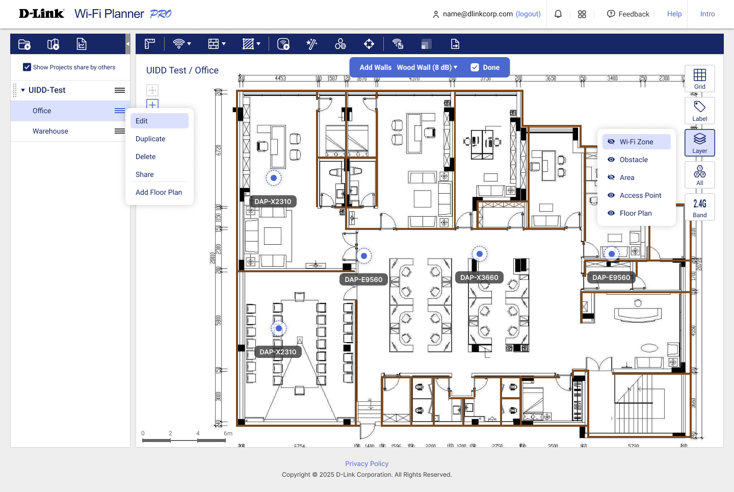
Problem. Every wall took repeated steps, and the tool can't say anything until every wall exists.
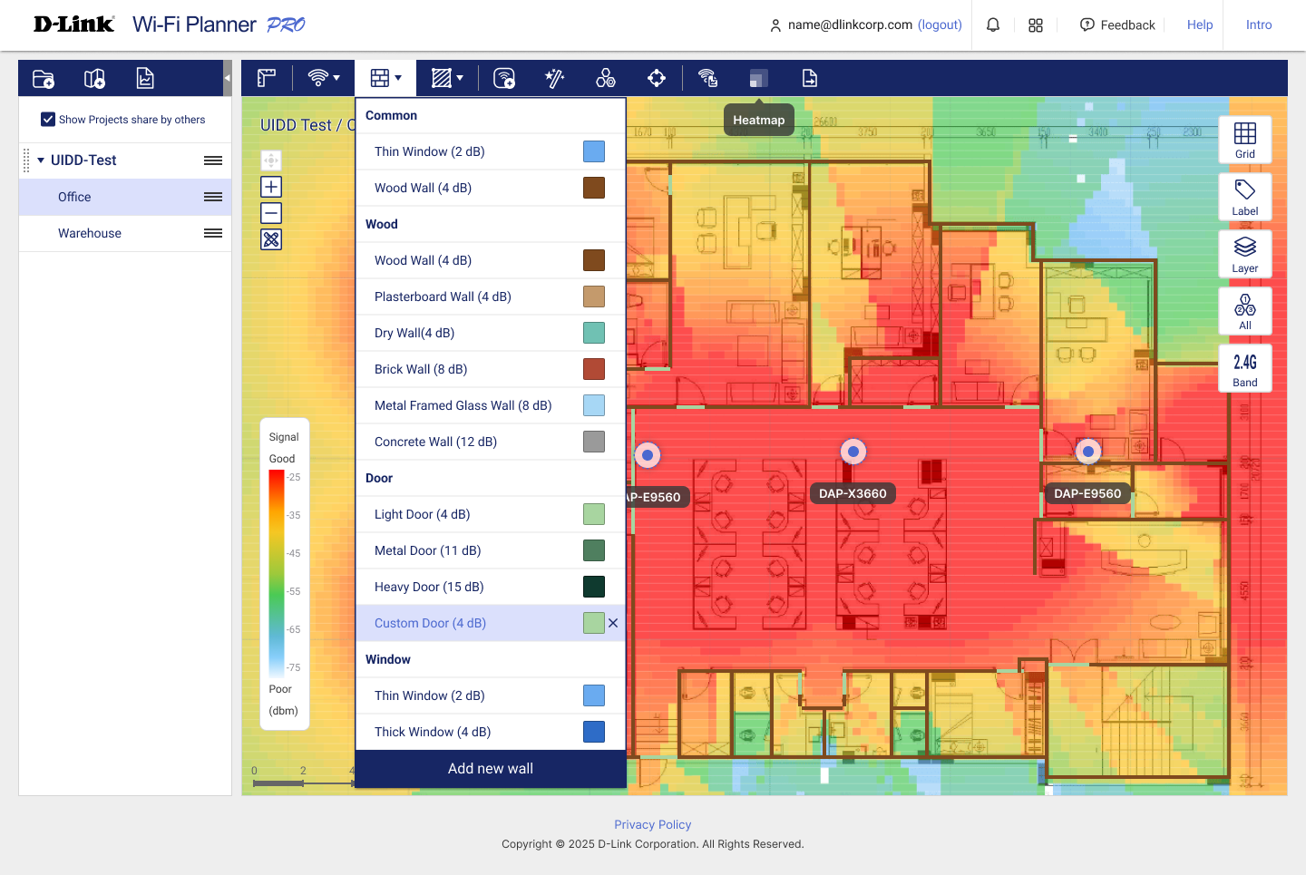
What changed. Wall materials can be switched while drawing, grouped into common, wood, doors and windows, each with its attenuation in dB. Frequent actions got shortcuts, and the canvas follows the delete, undo, copy and paste people already know.
Highlight #2
Only keep what changes the next step
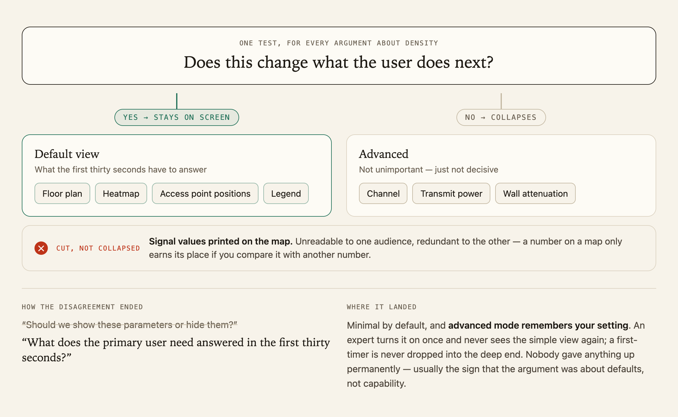
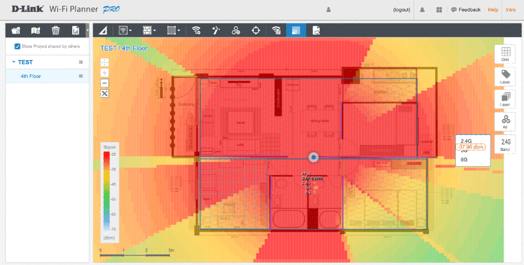
The rule. Does this change what the user does next? If yes, it stays on screen. If not, it moves to advanced. The default view has four things: floor plan, heatmap, access point positions and legend. Signal values printed on the map were removed.
The disagreement. Engineering wanted every parameter visible. Instead of arguing show or hide, I asked what the main user needs answered in the first 30 seconds, then tested prototypes with real tasks. Where it landed: minimal by default, and advanced mode remembers your setting.
Highlight #3
A colour scale people already read
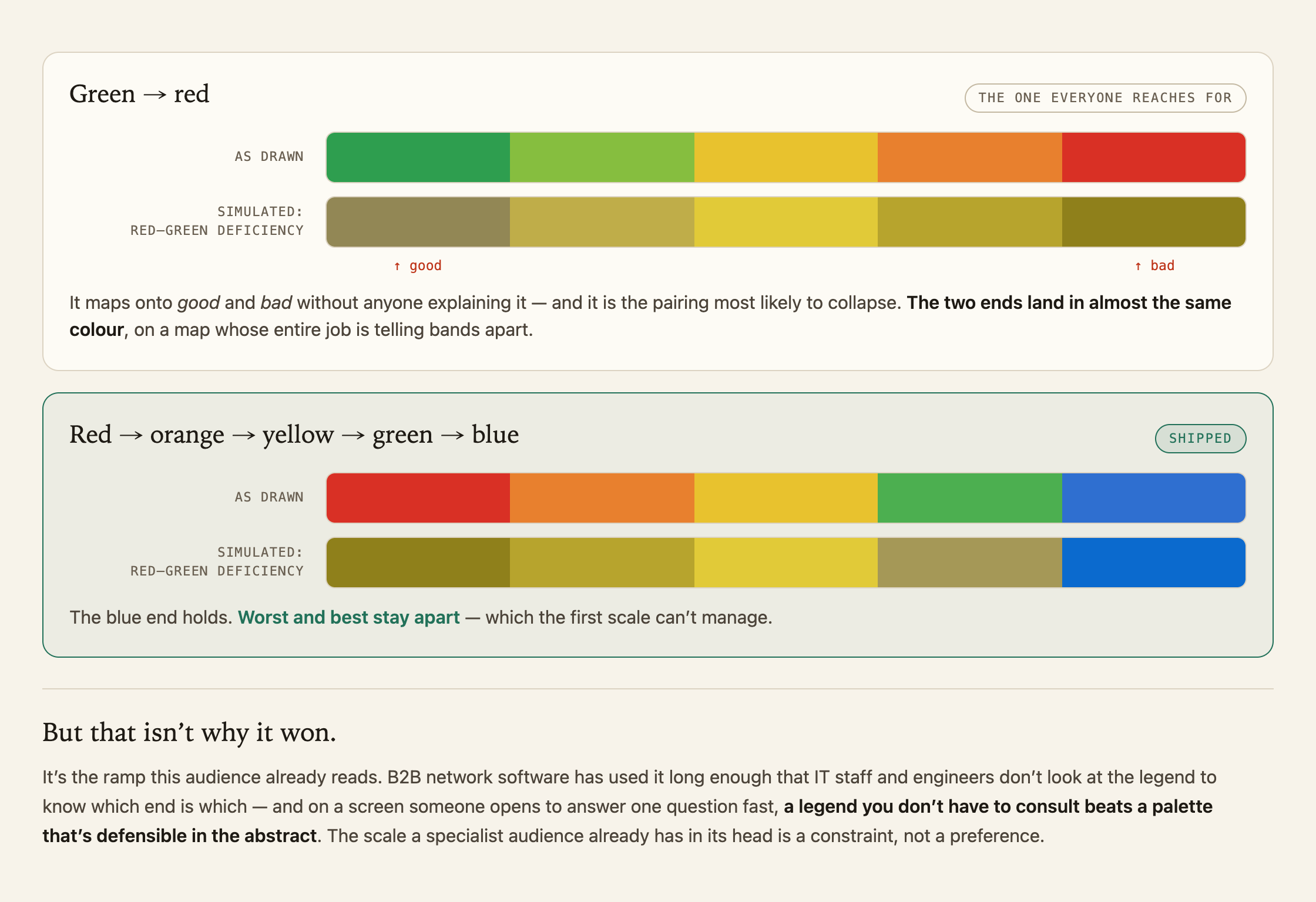
Problem. Green to red is the obvious choice, but for people with red-green colour deficiency the two ends look almost the same.
What changed. After talking it through with IT and R&D, I chose red, orange, yellow, green, blue: the ramp network software has used for years, so specialists read it without a legend. The legend also got the words Good and Poor, because the strong-signal end is red, which surprises newcomers.
Highlight #4
A spec engineering could build from
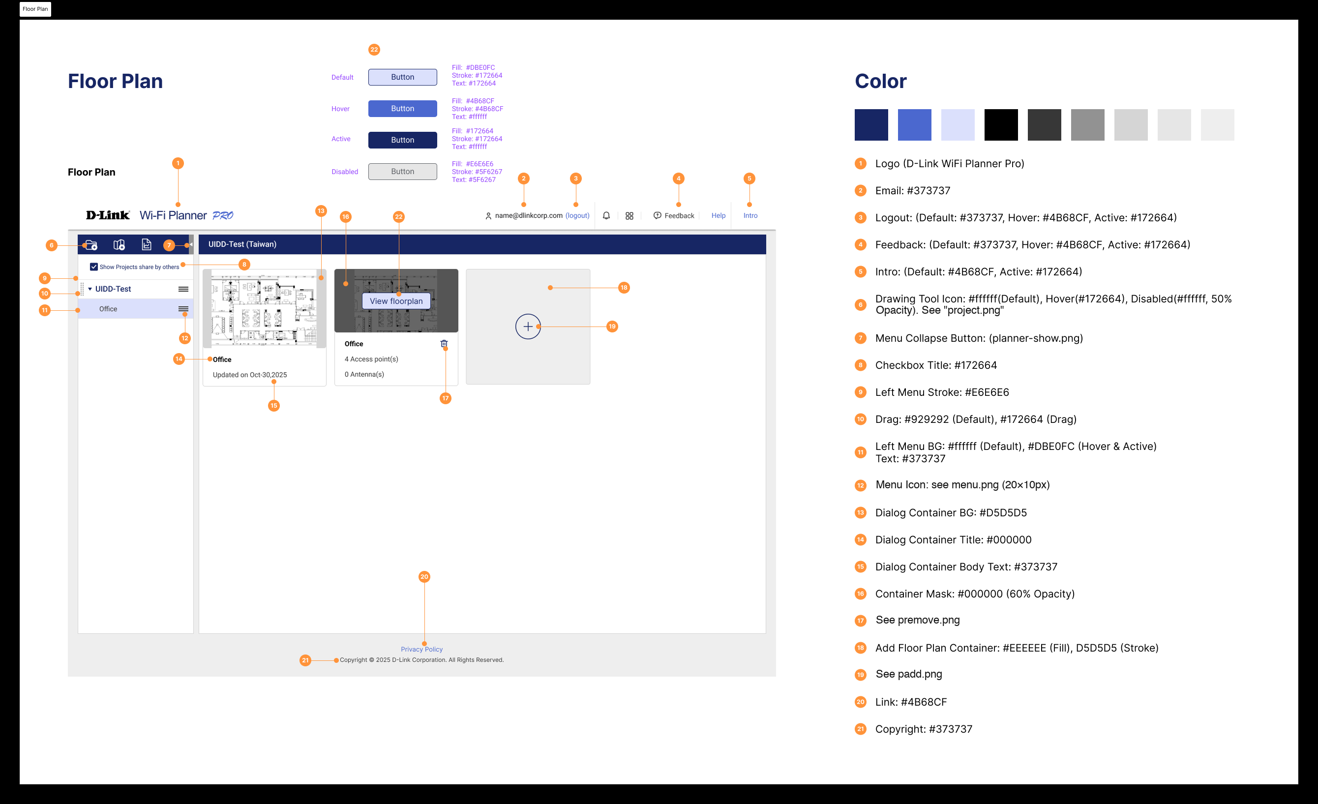
Every screen went to engineering as an annotated spec: numbered components, the exact fill, stroke and text colour for each, all four button states, and file names wherever an asset was needed. It cut out a whole class of "which grey was that?" conversations.
Looking back
Better, but I can't say by how much
- 1
I didn't measure before and after. The task and participants already existed; a stopwatch would have done it. People around me say drawing got easier, and that's all I can claim.
- 2
My August 2025 proposal had AI wall recognition: set a scale, let the tool find the walls, and people just correct them. Three months couldn't fit it, so walls are still drawn by hand, which is exactly the bottleneck the research found.
- 3
The heatmap's visual rules stayed inside this product. I didn't push them into a shared design system.