01
AQUILA PRO AI
Folding advanced router settings into an interface a parent will actually touch — without hiding what an engineer needs.
View the live product
A smart Wi-Fi app for the whole household. Built-in AI tunes coverage and performance automatically, so every connection stays smooth without anyone thinking about it.
TL;DR — three sentences
Mesh Wi-Fi is sold to ordinary households, but the category still designs its setup flow for people who understand networking.
We handed the box to ten people with no networking vocabulary and watched them set it up alone. Five sticking points came out — two of them weren't in the app at all.
Everything went into the fifteen minutes between opening the box and being online, and the five findings were split across the design, hardware and packaging teams.
My part
- Framing the research questions
- User research & usability testing
- Design strategy from research
- Interface design & prototyping
- Design system handoff
Platforms
- iOS
- Android
Team
- 1 UX designer
- 2 UI designers (incl. me)
- iOS engineer
- Android engineer
- Product owner
Client & timeline
- D-Link
- 2024.11 – 2025.10
Setup isn't one feature of the product — it is the product's first impression
A product built from zero. No previous version to reference, no existing user behaviour to observe. I had to decide how an ordinary household should manage its own Wi-Fi before a single person had ever used the thing.
Three constraints came attached. The launch schedule was tight. The interface had to stay compatible with older models, so I couldn't assume anyone was holding the latest hardware. And the palette had to line up with what the marketing team was already running, which ruled out a dark-led interface — that one came from the top.
The objective was narrow enough to be useful: someone with no networking knowledge should be able to set up and manage their home Wi-Fi, without that simplicity hiding the diagnostics an engineer needs.
Two business goals sat behind it, and neither of them lives in the interface. Returns: a router that won't set up doesn't get tolerated, it gets sent back — a failed setup converts directly into lost revenue. Support cost: every "I can't get this working" call costs money, and those calls pile up on the same few steps, which makes it a design problem rather than a user problem.
That's what decided where the budget went. Rather than spreading the redesign evenly across every feature, we put it on the step with the highest failure rate in testing and pushed Scenes and the other advanced features to a second phase. A business goal isn't background information — it's what tells you the order to work in.
Two benchmarks, two different answers to whether a user should have to understand their own network
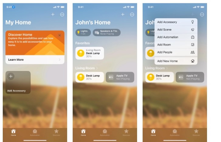
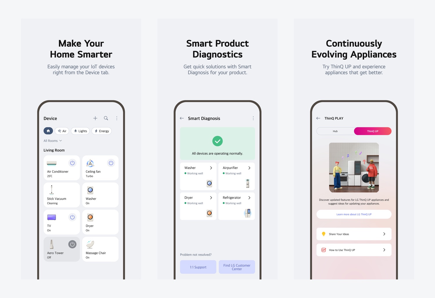
Two camps, and we sat between them. Apple HomeKit and LG ThinQ care about how every device in a home gets managed under one roof; TP-Link, Google Nest Wifi and Xiaomi care about whether the network itself is any good. Our product is a router, but the things it had to manage were drifting toward smart home.
The colour study wasn't of competitor apps — it was of our own hardware. The palette is a set of gentle blues: clean, unaggressive, modern, with a certain distance to it. That study set the direction for the whole interface: clean tech blue against soft domestic colour, rather than the dark technical look this category usually reaches for.
What we decided not to build: a customisable dashboard background. Engineering put the effort at more than we could spare, and it's a feature that looks good without solving anything. On a tight schedule that's the first thing that should give way.
What I took from LG ThinQ: hardware-level diagnostics per product, and a store inside the app. The first one matters especially for a router — when something breaks, the first thing a person wants to know is whether the box itself is faulty.
- #C2D4E8Light
- #859CC7Mid
- #60789BDeep


We watched ten people open the box
The sample was deliberate. Not "average users" — the people least fluent in networking vocabulary, setting one of these up for the first time. Ten female colleagues.
The reasoning: this product's real failure case isn't someone who understands networks failing to set it up. It's a household where nobody understands networks, and the person who got volunteered is left staring at SSID, band and factory reset. If they can finish, everyone else is fine. You design a setup flow against the end most likely to fail, not against the average.
This app had no previous version to test, so the study ran on the generation before it — a D-Link Eagle Pro AI M32 and the app that shipped with it. We ran the whole out-of-box experience: unpacking the unit, connecting the cables, going through setup, until they were actually online. Not a test of whether that old interface looked good — a test of where someone who has never set up a router gets stuck.
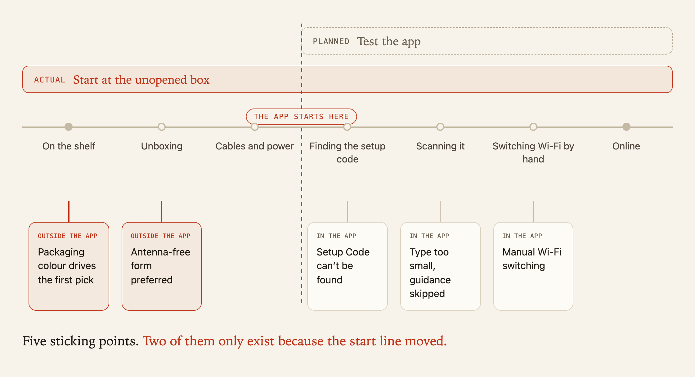
The scope was widened on purpose. We had planned to test the app alone, then pushed the start line back to the unopened box — a user doesn't separate "this is an app problem" from "this is a product problem", they just decide the thing is hard to set up. That call paid off: of the five sticking points, two weren't in the app at all.
The three inside the app first. Each one changed the design.
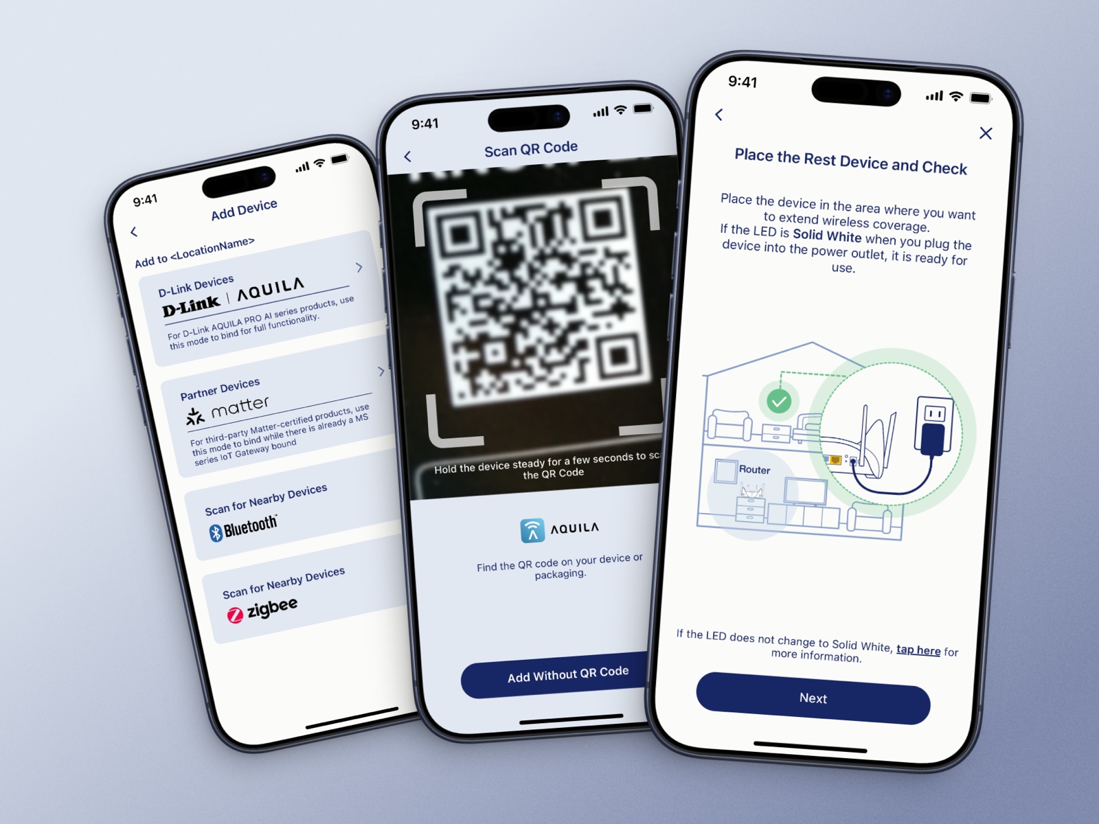
Nobody could find the setup code. It's printed on the unit, but describing where in words wasn't working. We replaced the description with an illustration marking exactly where it sits on the hardware. And when a scan failed, we stopped returning a generic error and started saying what actually went wrong.
Nobody reads. People hit next the moment a screen appears; the instructions may as well not exist. So key information became image-first, one idea per screen, body type went up, and anything non-essential was demoted or deleted. If users don't read, don't bet the outcome on words.
Switching Wi-Fi by hand stranded people. Setup requires hopping onto the device's own network, and plenty of testers went out and never came back. We pulled that step inside the app's guidance, and showed clear progress with an expected wait — so that waiting never gets mistaken for broken.
One more that nobody predicted: some testers wanted the new network to reuse their old SSID, so their phones would reconnect on their own. They just had no idea where that setting lived.
The other two landed outside the app entirely. With boxes lined up side by side, the first pick was driven almost entirely by colour — clean white grounds won. And on form, "a cube with no antennas" got described as more modern, more at home in a living room; antennas read as server-room equipment. Neither was mine to fix. Knowing who to hand them to was the point.
All of it collapsed into one rule for the redesign, and everything after this chapter follows from it: let the user do one thing per screen, and tell them immediately whether it worked.
Finding
Setup Code can't be found
Owner
App + hardware labelling
Where it went
Design team leads; hardware asked to move the label
Finding
Type too small, guidance skipped
Owner
App
Where it went
Design team
Finding
Manual Wi-Fi switching
Owner
App + firmware
Where it went
Design team, with engineering on the connection handoff
Finding
Packaging colour drives the first pick
Owner
Packaging design
Where it went
Handed to industrial design / marketing
Finding
Antenna-free form preferred
Owner
Industrial design
Where it went
Handed to the hardware team
| Finding | Owner | Where it went |
|---|---|---|
| Setup Code can't be found | App + hardware labelling | Design team leads; hardware asked to move the label |
| Type too small, guidance skipped | App | Design team |
| Manual Wi-Fi switching | App + firmware | Design team, with engineering on the connection handoff |
| Packaging colour drives the first pick | Packaging design | Handed to industrial design / marketing |
| Antenna-free form preferred | Industrial design | Handed to the hardware team |
This triage table is the output I care most about. It turns "users find it hard" into five concrete items with an owner attached — research earns its keep not by being thorough, but by changing someone's decision.

We put up A and B — what shipped was C
We put up two directions. The difference wasn't how they looked — it was whether to touch the flow structure at all. One conservative, one aggressive, deliberately staking out both ends of what was possible.
Neither got picked. The decision came back as a third direction, and that's the one that shipped.
That stung at the time. Looking back, the outcome is the argument for why A and B were worth making: they weren't two candidate answers, they were two stakes in the ground. Once the conservative and the aggressive extremes are both on the table, a decision-maker can finally point and say "I want something between these, leaning that way" — a sentence that doesn't exist before they've seen A and B.
If two of three proposals exist so the third one can be found, those two weren't wasted. But you have to put the extremes up first, so there's something to push against.
Whichever direction won, the bar was the same: does it clear the two steps with the highest failure rate, is it buildable inside the technical constraints, and can it ship and be validated before the deadline.


Move the branching to the front, so nobody finds out halfway that they picked the wrong path
Everything in this chapter follows from the testing above: people don't read, and they can't find things on the hardware.
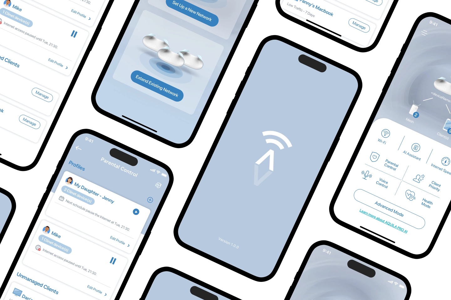
The product has several installation paths — wired and wireless each work differently — and it was easy to get stranded halfway through one. Collapsing the flow meant moving the branching to the front: the user picks a path once, at the start, instead of discovering halfway through that they're on the wrong one. Every step after that carries an illustration showing exactly where the physical button sits on the unit, and which model the person is looking at. Nobody has to guess which button someone meant.

Automatic optimisation has a strange problem: the better it works, the less anyone notices it
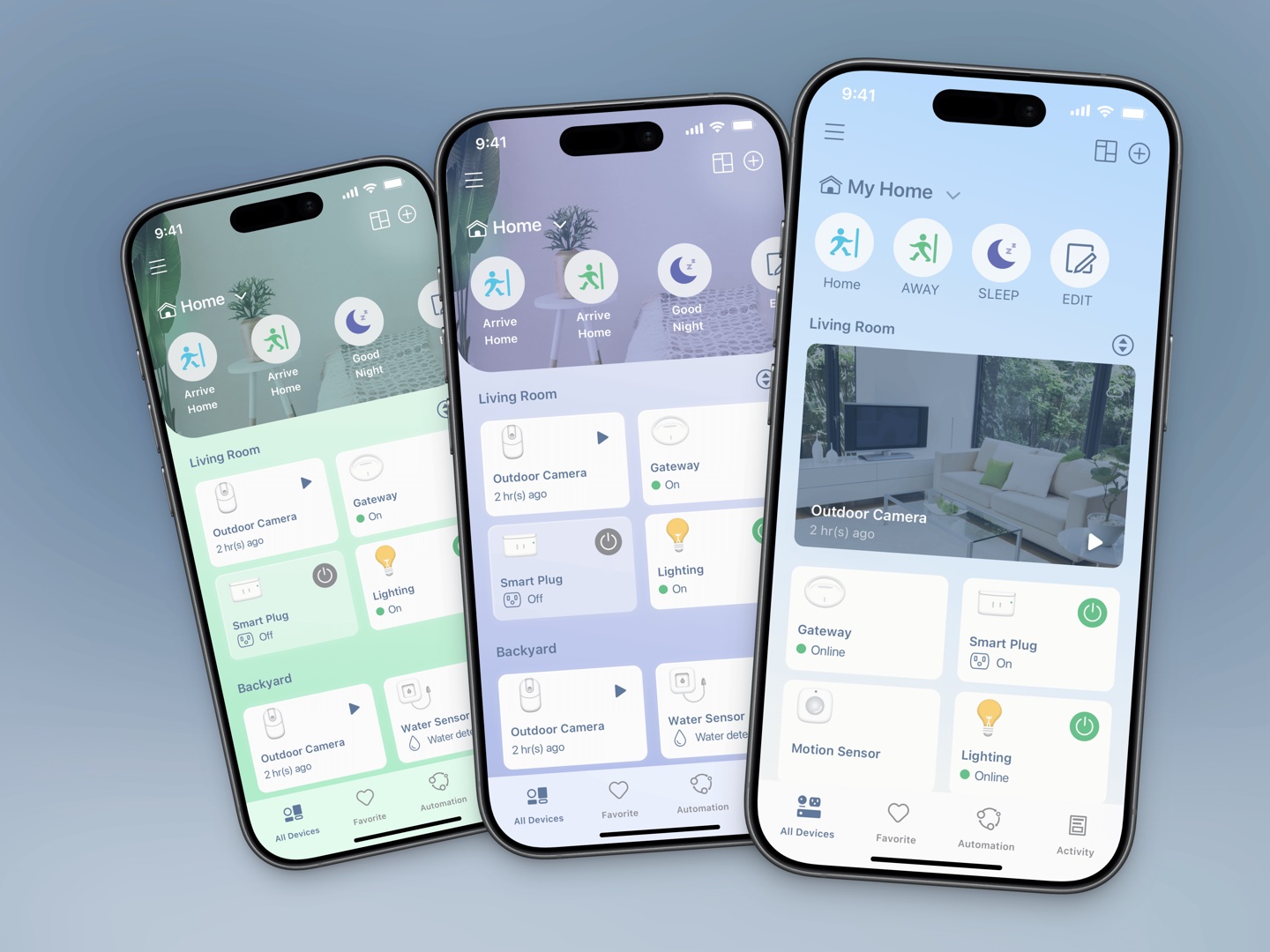
I originally proposed a dark mode. Beyond the palette direction handed down to me, there was a more practical reason I ended up dropping it myself: the router hardware is dark. Put a product shot on a dark interface and it dissolves into the background — during setup, people genuinely couldn't tell which model they were holding. This interface has to show the device constantly, so the light ground turned out to be the right answer regardless of who asked for it.
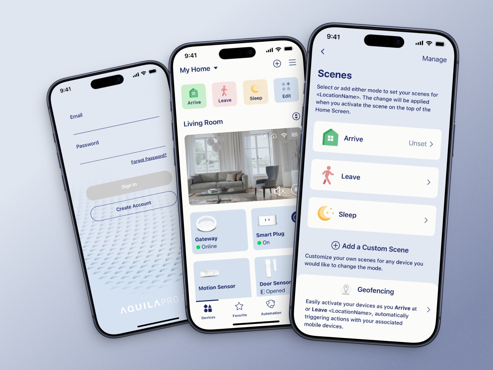
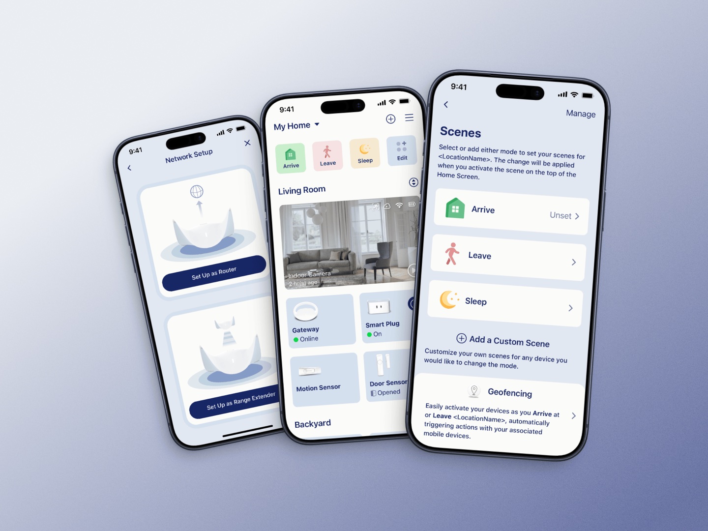
Scenes can be applied straight from the presets — Arrive, Leave, Sleep — or built from scratch. Selecting one hands off through a light transition to the icon picker, where a scene-shaped icon finishes the setup in seconds. The micro-interactions — a slight scale and brightness shift on selection — follow a single rule: fewest actions, clearest feedback. That rule came straight off the testing floor. Frustration usually wasn't the number of steps; it was not knowing whether the last tap had registered.
The other thing to solve was making the AI visible. Automatic optimisation has an odd problem: the better it works, the less anyone notices. No screen, no action — as far as the user is concerned, nothing happened. The fix was to make it leave a trail. The system files a weekly report on its own and notifies the user when it lands, so optimisation stopped being an invisible background process and became something that knocks once a week to say what it did.

- Arrive
- Leave
- Sleep
- New scene
- Pet
- Vacation
Make compliance the default and a designer never has to make the call again
Accessibility isn't an audit you run after the design is done. We settled a set of colours that passed the checks first, and from then on every interface could only draw from that set. Contrast, type size and touch targets went into the component specs rather than into a review at the end. Make compliance the default and a designer never has to make the call again.
One hard rule on top: colour never carries meaning alone. Every state ships with colour, icon and text together. That single rule solves two problems at once — someone with a colour vision deficiency reads the state correctly, and the meaning survives when a translated string changes length.
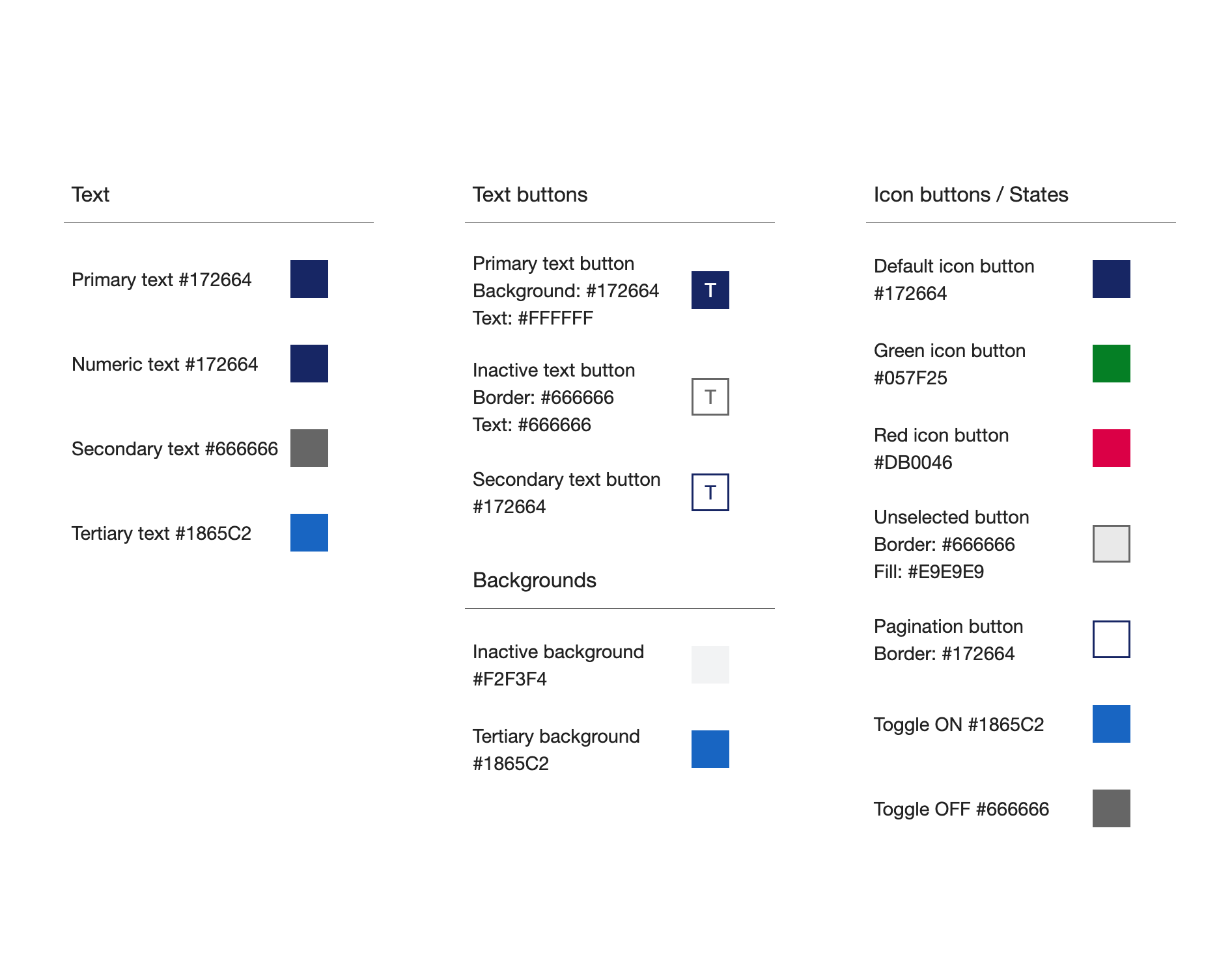
What got handed over wasn't a swatch sheet. It was a system someone else could pick up and keep building on: colour tokens with state definitions, a type scale, cards and bars, buttons and inputs, background layers, and assembled screens showing how the pieces go together.
Specs went down to the level you can build from — the primary button is 276pt wide, 46pt tall, 15pt of padding each side, in three sizes (276 / 130 / 94pt) and four states (primary, secondary, alert, disabled). Writing it to the point was deliberate. Specs passed along verbally, with every implementation guessing differently — that's a mistake you only need to make once.
Same reasoning behind the last thing in the handoff: alongside the Figma file and the annotated specs on Zeplin, I wrote the micro-animation code myself. Handing an engineer a video of the motion you want is a request; handing them the code is a decision that's already been made.
- #172664Primary text
- #666666Secondary
- #1865C2Link
- #057F25Success
- #DB0046Alert
Use
Primary text / primary button
Token
#172664
Contrast
14.0 : 1
WCAG
AAA
Use
Secondary text
Token
#666666
Contrast
5.7 : 1
WCAG
AA
Use
Links & emphasis
Token
#1865C2
Contrast
5.7 : 1
WCAG
AA
Use
Success icon
Token
#057F25
Contrast
5.2 : 1
WCAG
AA
Use
Alert icon
Token
#DB0046
Contrast
5.1 : 1
WCAG
AA
Use
Disabled text on disabled fill
Token
#666666 / #F2F3F4
Contrast
5.2 : 1
WCAG
AA
| Use | Token | Contrast | WCAG |
|---|---|---|---|
| Primary text / primary button | #172664 | 14.0 : 1 | AAA |
| Secondary text | #666666 | 5.7 : 1 | AA |
| Links & emphasis | #1865C2 | 5.7 : 1 | AA |
| Success icon | #057F25 | 5.2 : 1 | AA |
| Alert icon | #DB0046 | 5.1 : 1 | AA |
| Disabled text on disabled fill | #666666 / #F2F3F4 | 5.2 : 1 | AA |
All pass AA; primary text reaches AAA. Disabled is the state most often let go — the usual move is to fade it until it's unreadable to say "you can't press this". Here it stays inside the readable range and the message is carried by colour hierarchy instead of by taking legibility away.

The number I regret most is the one I never measured
What can be verified: the product shipped. The colour system passes WCAG AA across the board with primary text at AAA. The design spec went out documented down to the point. And two of the five findings crossed out of the app entirely and landed with the hardware team. All of that has its evidence in the chapters above, so I won't restate it.
What's worth more space is what I'd change.
The sample had no control group. Recruiting the people least fluent in networking vocabulary was deliberate, but every participant sat at the same end of the range, so I couldn't separate "this trips up this group" from "this trips up every first-timer". Next time I'd keep the primary group and add a handful of network-literate users as a baseline — not for balance, but to find out how widespread each problem actually is.
I never took a baseline measurement. This is the biggest mistake I made on this project. At the time, watching behaviour felt like enough. Without numbers from before the redesign there was no way to prove the redesign was better — which is exactly why this case study can only offer qualitative outcomes.
The decision-maker came in too late. We only learned the direction lay somewhere else after A and B were on the table. Aligning on the criteria first, with cheap sketches, would have aimed the exploration better — the extremes are still worth proposing, just with one less lap around the track.
Running it again, I'd fix these five metrics before testing starts and measure them on both sides of the redesign:
Metric
First-time setup completion rate
Why measure it
The floor for whether the product works at all — and the one that maps most directly to returns
Metric
Time to first connect
Why measure it
Box to online, end to end — the most direct proxy for how the experience felt
Metric
Share who needed help to finish
Why measure it
Maps to support cost — the number finance understands fastest
Metric
Time lost at the Setup Code
Why measure it
Aimed at the single worst step, to verify the fix actually hit it
Metric
Unassisted factory reset rate
Why measure it
Whether someone can recover from a mistake — which decides whether they return the box
| Metric | Why measure it |
|---|---|
| First-time setup completion rate | The floor for whether the product works at all — and the one that maps most directly to returns |
| Time to first connect | Box to online, end to end — the most direct proxy for how the experience felt |
| Share who needed help to finish | Maps to support cost — the number finance understands fastest |
| Time lost at the Setup Code | Aimed at the single worst step, to verify the fix actually hit it |
| Unassisted factory reset rate | Whether someone can recover from a mistake — which decides whether they return the box |
What these five have in common: every one of them converts into money. For research to reach a product decision, the people who don't do design have to be able to see what it costs.