04
Pace
A health app that never scores you. The hard part wasn't making it gentle — it was proving that gentle actually reads as gentle.
View the live product
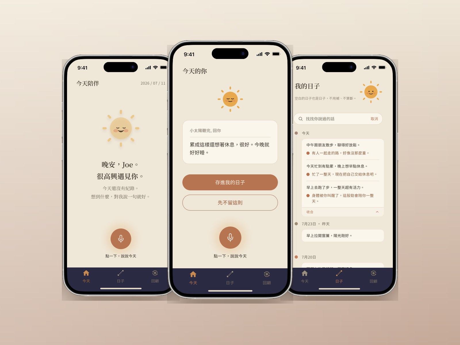
An anti-KPI health journal. You say one sentence, a small sun says one back, and it goes into your days. No streaks, no completion rings, no red dots — and the empty days stay empty.
TL;DR — three sentences
Health apps turn looking after yourself into a scoreboard — and the people who need one most are exactly the ones who quit because of it.
Pace removes every score. One sentence in, one gentle sentence back. Days with nothing in them stay blank, and nothing on screen calls that a failure.
The riskiest screen in a gentle product is the one where it fails. I wrote two versions of the failure message and shipped them as separate builds, so no participant could tell they were in a comparison.
My part
- Product positioning
- Design system v1.0
- Interface & flow design
- A/B test on the failure copy
- Built and shipped the prototype
Platforms
- iOS (concept)
- Web prototype
Team
- Solo — design and build
Client & timeline
- Self-initiated · AAPD bootcamp
- 2026.07
The people who most need a health app are the ones it drove away
Every health app on my phone worked the same way. It set a target, then measured me against it. Steps, calories, closed rings, a streak counter. Miss a day and you get a red dot; miss three and the streak is gone — and so is the reason to open it tomorrow.
That's a design decision, not a law of nature. Somewhere it was decided that motivation comes from measurement, and for a certain kind of user it genuinely does. For someone who is already worn out it does the opposite: looking after yourself turns into another performance review, and the thing that was supposed to help becomes one more place you're failing.
So the brief was narrow, and awkward: build a health app with no score at all, and still make it worth opening tomorrow.
The awkward half is the second one. Take away streaks, percentages and red dots and you have also taken away every mechanism this category uses to bring people back. Whatever replaces them has to work emotionally rather than punitively — which is much harder to design, because you can't measure your way there.
The whole category answers one question the same way
The question is: what do you do when the user doesn't show up? Every app in this category answers it the same way — mark it, break the streak, show the gap. The gap is treated as information the user needs to see.
Pace answers it differently, and that single disagreement generates almost every other decision in the product. If a blank day isn't a failure, then there's nothing to mark. If there's nothing to mark, the timeline can just show the blank. If the timeline shows the blank without comment, the weekly view can't be a completion rate — it has to be a piece of writing.
So the comparison below isn't a feature checklist. It's one position, followed through.
Core logic
The usual health app
Track the data, push you to the target
Pace
Catch the state, keep you company
What you get back
The usual health app
Charts and numbers
Pace
One sentence, about right now
When you miss a day
The usual health app
Red dot, warning, broken streak
Pace
A blank that stays blank
How you record
The usual health app
Fill in a form, tick the boxes
Pace
Say one sentence out loud
How it feels over time
The usual health app
More pressure
Pace
Less
| The usual health app | Pace | |
|---|---|---|
| Core logic | Track the data, push you to the target | Catch the state, keep you company |
| What you get back | Charts and numbers | One sentence, about right now |
| When you miss a day | Red dot, warning, broken streak | A blank that stays blank |
| How you record | Fill in a form, tick the boxes | Say one sentence out loud |
| How it feels over time | More pressure | Less |
The row that decides the product is the third one. Everything else follows from what you do with an empty day.
The riskiest screen in a gentle product is the one where it fails
Making the happy path gentle is easy — everything is going well, so of course the copy is warm. A product's actual manners only show when something breaks. For Pace the breaking point is obvious: speech recognition fails, and the app has to tell you it didn't catch what you said.
That's the moment the whole positioning is either true or a decoration.
So I wrote it twice.
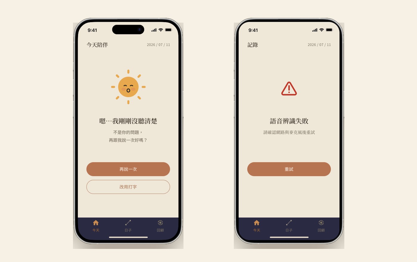
A keeps the sun on screen. "Sorry — I didn't quite catch that. It's not your fault, could you tell me once more?" Two ways out: say it again, or switch to typing.
B is the standard system error. A red warning triangle. "Voice recognition failed. Please check your network and microphone, then retry." One way out: retry.
The difference isn't tone, it's who is at fault. A takes the blame and hands back a second route. B hands the problem to the user and sends them off to check their own equipment. On Pace's terms — don't punish, don't blame — A should be the answer and B is the control.
The hard part was testing it without poisoning the result. I couldn't show both versions to the same person. Anyone who sees a "gentle version" next to a "neutral version" works out within seconds that they are in a comparison, and starts answering the question they think you're asking. They'll tell you the gentle one is nicer, because that is obviously the answer you want. The data is then worthless — that's a demand characteristic, and it's self-inflicted.
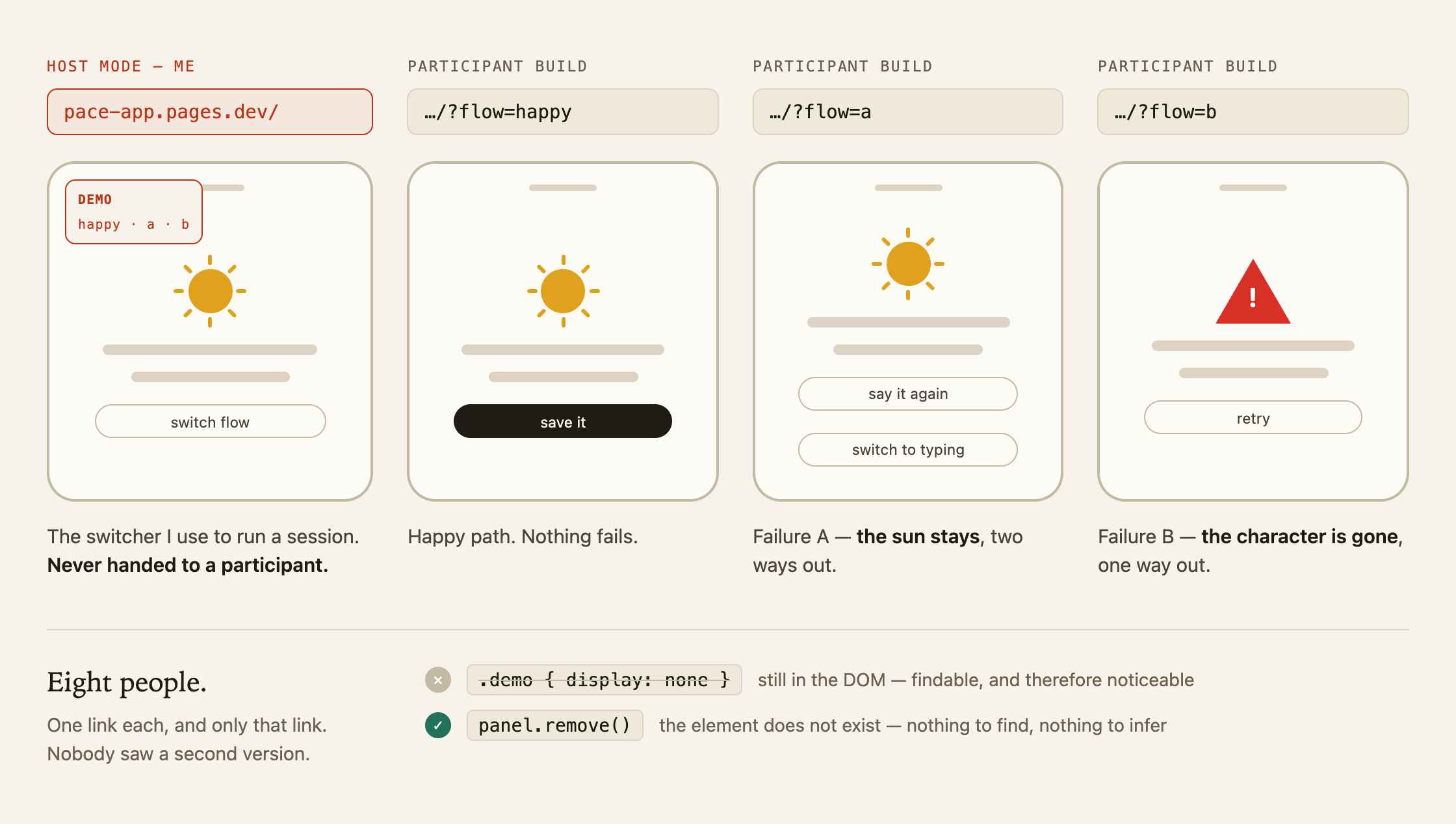
So the prototype ships as three separate entry points — one for A, one for B, one for the clean happy path. Each participant gets only their own link. The demo switcher isn't hidden on those builds, it's removed from the page entirely, so there's nothing to find in the interface and nothing to notice. From the inside, each build simply looks like the product.
Eight people ran it, split across the three links.
A won, and the reason people gave was the character. What they responded to wasn't the wording, it was that the sun was still there. B's red triangle came back described as told off — the same information, but the product had stopped being a companion and become a system reporting a fault. That's the finding worth carrying: in a product whose entire premise is that it won't judge you, the failure screen is where the premise is tested, and the thing that keeps the promise is presence rather than politeness. Softer copy under a warning triangle would not have saved it.
And one person asked for something nobody had designed. They misspoke mid-recording, and wanted a way to not keep that one — without it being deletion, without it counting as anything. Which turned out to be the same product principle arriving from the other direction: if a blank day isn't a failure, then a sentence you'd rather not keep isn't one either. Don't keep this one now sits under the save button in the shipped prototype. It's the one screen in this project that came from a user rather than from me.
Recording is one gesture, not a place you go
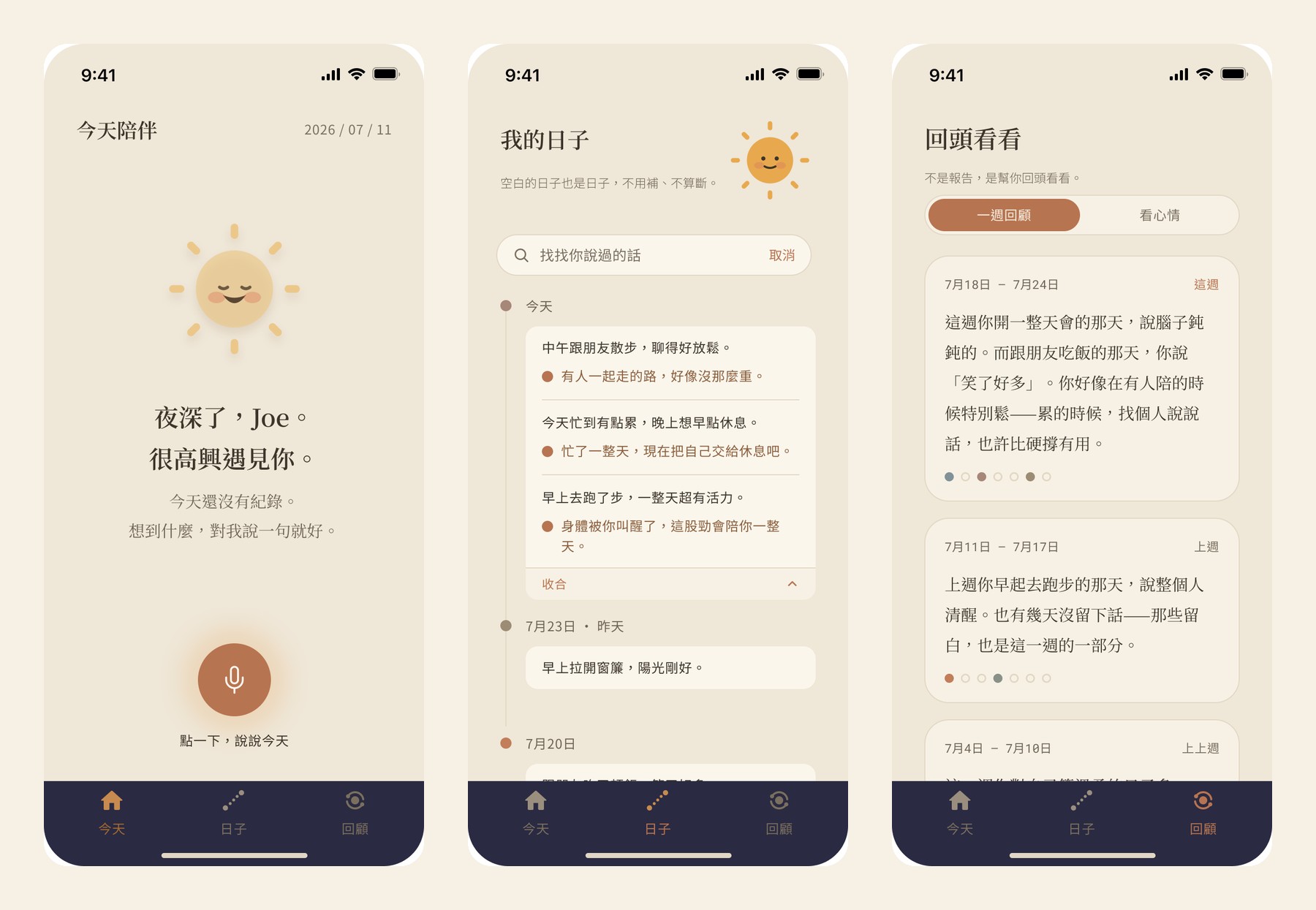
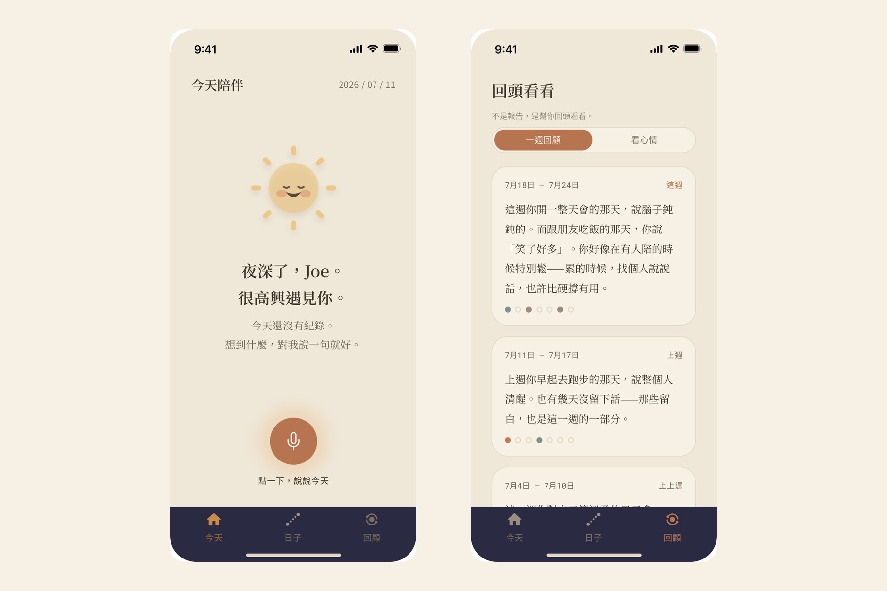
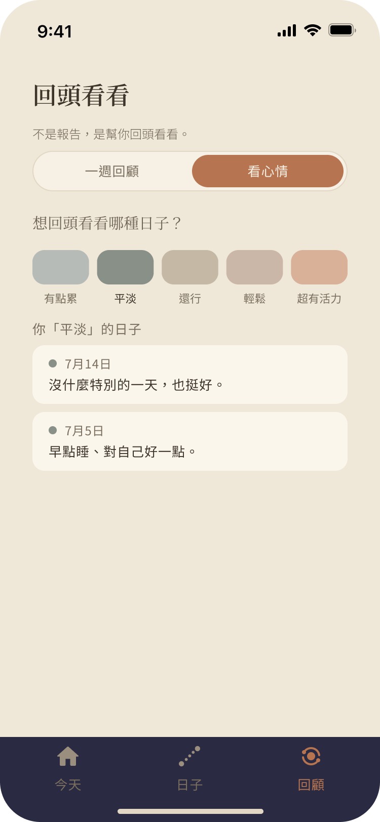
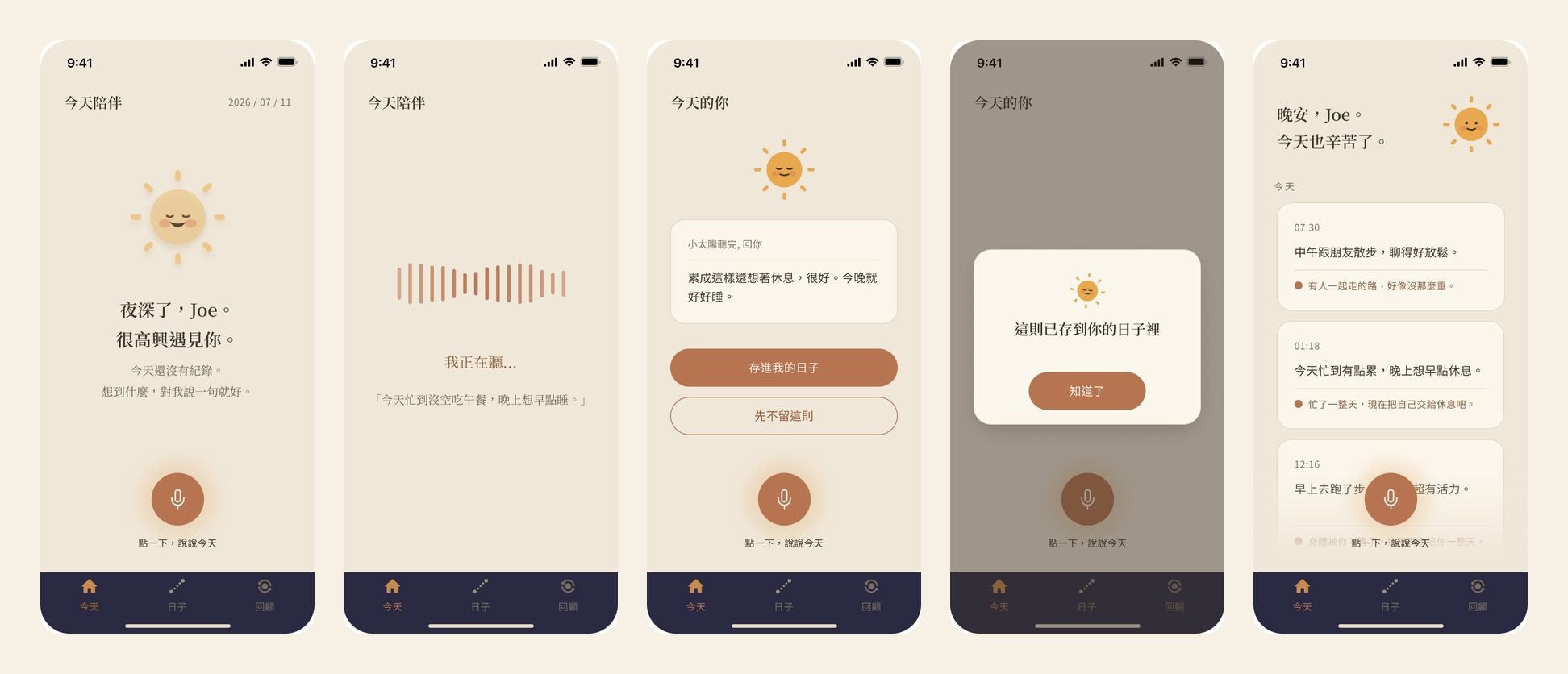
Three tabs, and that's the whole structure. Today is where you are now. Days is everything you've said, searchable. Look back is the week, written as a paragraph rather than a chart.
The decision worth explaining is that recording isn't one of them. Pressing the voice button runs listening → the sun's reply → saved, and all three are states of the same screen, not pages you navigate between.
That's not a tidiness preference. The moment recording becomes a destination, it becomes a task — something you go somewhere to do, and therefore something you can be behind on. Keeping it as one gesture that starts and finishes where you already are is what stops it feeling like homework. The same reasoning shows up later in the design principles as "one primary action".

The empty state is the entire argument
In most products the empty state is a leftover — the screen you design last, for the case where there's no data yet. Here it's the thesis statement, because an empty day is exactly the case the rest of the category punishes.
So it's the screen I wrote most carefully. Nothing has happened today, and what it says is: nothing recorded yet. Tell me one sentence, whenever something comes to mind. No badge, no dot, no gentle nag. In the timeline, a day with nothing in it says this day was left blank — and stops there.
The weekly view is the same argument at a larger scale. It could easily have been five out of seven. Instead it counts what's there and then says the quiet part out loud: the two blank days are part of you too. That sentence is the product's whole position compressed into one line, and it only works because nothing else on screen contradicts it.
What replaces the score is the sun. You say something, and it answers — briefly, and specifically to what you said. That's the swap the product is built on: a response instead of a rating. A number tells you where you rank. A reply just tells you someone heard.
A design language that doesn't score you
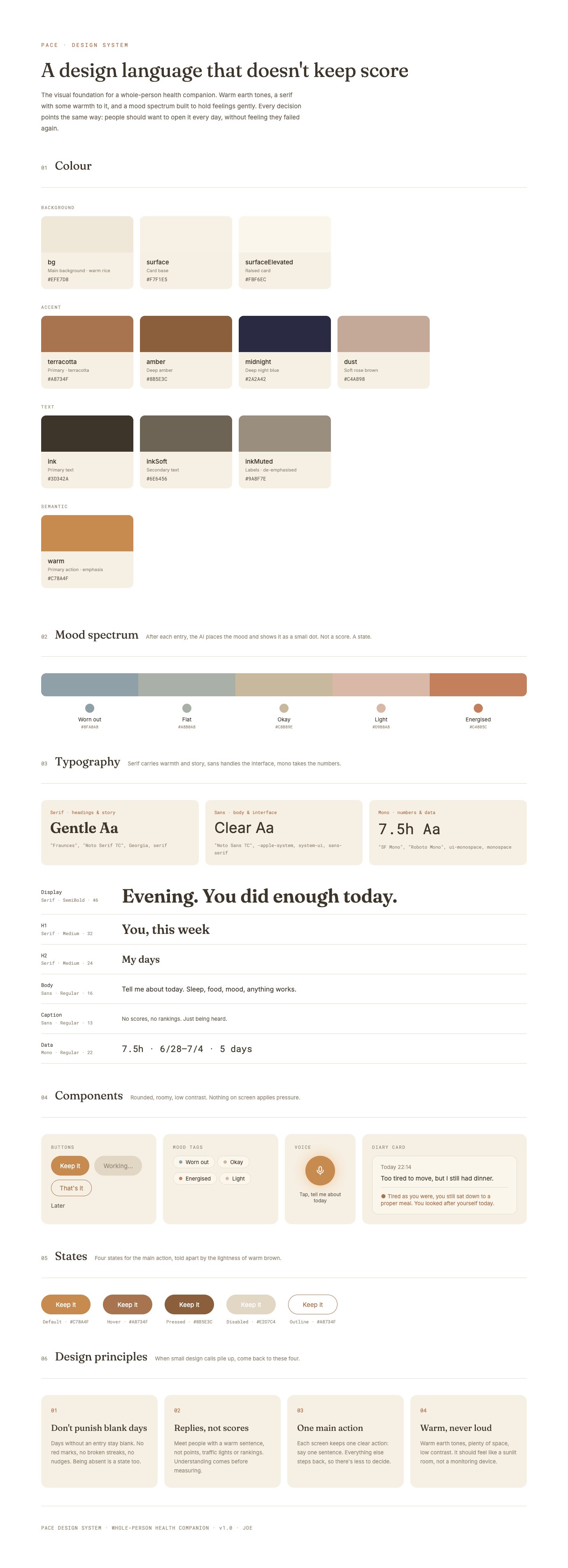
The system is one sheet, and it exists because "be gentle" is not a specification. Left as a feeling it survives about three screens before someone reaches for a red for an error state and the whole position quietly collapses.
Six parts: colour, a mood spectrum, type, components, states, and the principles.
Two of them are load-bearing. The mood spectrum has five named states and no numbers — tired, flat, okay, light, full of energy. Ordered, because moods do sit on a range, but never converted into a score, because the moment it becomes 2 out of 5 the app is grading you again. And the palette has no red. The strongest colour available is a terracotta, which is the same colour used for the primary action — so an error can never be louder than an invitation. Ruling red out at the token level means nobody has to remember the rule later; the sheet enforces it.
The four principles at the bottom are the ones I'd hand to anyone picking this up: don't punish blank space · a response instead of a score · one primary action · warm but not stimulating. They're written as instructions rather than adjectives, so they can actually settle an argument about a specific screen.
- #EFE7D8Background
- #C78A4FPrimary action
- #A8734FTerracotta
- #2A2A42Midnight
- #3D342AInk

A static prototype can't fail, which is exactly why it couldn't test this
The comparison in chapter three needed something a Figma prototype can't do. Testing a failure message means the failure has to actually happen, at a moment the participant doesn't choose, followed by a retry that then works. In a click-through prototype that's a hotspot the participant taps on purpose — which is not the same experience and doesn't test the same thing.
So I built it. Figma MCP reads the design file, Claude Code writes the components, Cloudflare Pages serves it. No GitHub, no engineer, no handoff — from a finished frame to a URL I could send someone, in the same working session.
That's the part of my process I'd want a team to see, so here is what it actually changes rather than what it sounds like.
The prototype disagreed with the design file, and the file lost. The greeting reads good morning / afternoon / evening from the clock. A static frame can only ever be frozen on one of them, so in Figma it says good evening forever; running code made it obvious that the greeting is behaviour, not a string. Same with the cards: what Figma holds as separate scenes are states of one screen here, because entries have to actually accumulate before you can tell whether the timeline feels like a diary or a log.
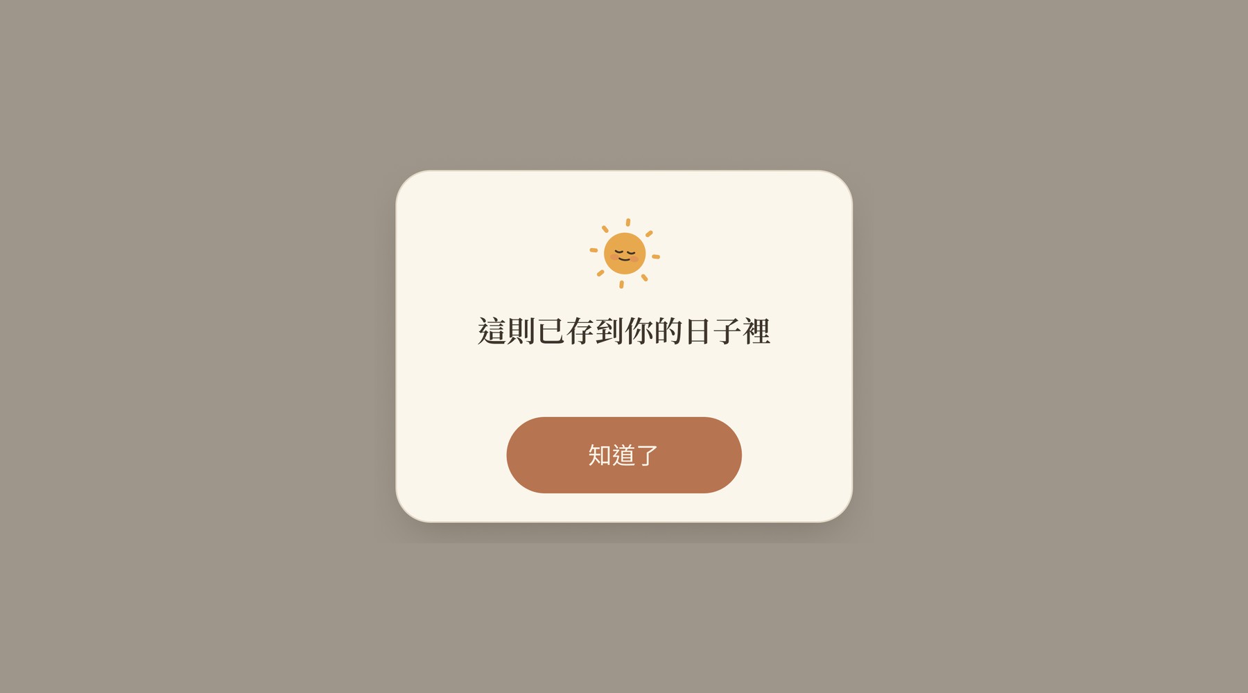
And a review changed the design. The save confirmation had a headline saying this one is saved to your days — a notification, past tense, the thing is done — sitting above two buttons: don't keep it and got it. A question under a statement. The copy had already closed the decision the buttons were still offering. It's one button now, and the Figma component was cleaned up to match rather than left to drift.
What this is worth to a team isn't speed. It's that "can we test this?" stops being a scheduling question. The failure path existed because building it cost an afternoon instead of a sprint — and if it had cost a sprint, I would have shipped the gentle version on instinct and never found out.
What I'd change: I designed the measurement, then stopped short of the population
What exists and can be checked: a live prototype anyone can open, a design system I wrote and then actually built against, and a comparison set up so the result would mean something.
That last one is here for a reason. On AQUILA the mistake I regret most is that I never took a baseline — I watched behaviour, decided that was enough, and afterwards had no way to prove the redesign was better. On this project I built the measurement first and the screens second. That's the correction, and it's the only reason this chapter can say anything at all about which version worked.
What I'd change:
Eight people across three groups is two or three per cell. I built the comparison so the answer would be clean, then ran it past classmates — which is half the job done well and half done conveniently. What eight people can give you is a consistent reason (they all pointed at the same thing, and the reason was the same reason), and that's worth something. What they can't give you is a rate. I'd write that sentence into the report next time rather than leave a reader to work out which one they're holding.
I tested the failure screen and not the thing it's protecting. The riskiest screen was the right place to start, but the actual product claim is that a scoreless app still gets opened tomorrow — and one sitting can't test that. It needs weeks, and the only honest way to know is to leave it with someone and come back.
The voice input is scripted. Speech recognition is faked in the prototype: each tap plays the next line. For testing copy that's fine, and arguably cleaner. For testing whether people will actually talk out loud to their phone in a room with other people in it, it proves nothing.