03
mydlink Smart Home
Cameras, plugs and sensors each worked their own way. We merged them into one system, so a new device no longer needs a new interface.
The 30-second version
- The problem
- One app had to handle cameras, plugs and sensors, each with its own logic. The more devices were added, the more it felt like several products stitched together.
- What we did
- As one of two UI designers, I designed the interface, state components and visual system. We gave every device the same set of states, and changed setup so the app finds the device over Bluetooth.
- Result
- Shipped and still in use. App-related support questions dropped, and other teams started building with the components. No before-and-after numbers.
My part
- Interface design & prototyping
- State components & visual system
- Cross-device consistency rules
- WCAG contrast pass
Platforms
- iOS
- Android
- Web
Team
- 2 UX designers
- 2 UI designers (incl. me)
Client & timeline
- D-Link
Background
One app, three kinds of device
mydlink is D-Link's smart home app, on iOS, Android and the web. The team was two UX and two UI designers. I was one of the UI designers, responsible for the interface, state components and visual system.
A plug is on or off. A sensor is an event at a point in time. A camera is live video, recordings, storage plans and permissions all at once. Every new device type added another set of screens.
Design challenge
Three kinds of device, three platforms, one language
The obvious move is one shared device card, but that only buys a consistent look: as soon as a camera needs to say something a plug can't, the card breaks.
So we unified the states instead. Any device, whatever it is, is found, connecting, named, working or unreachable. A new device only has to report its state, and the interface already knows how to show it.
- 5
- shared device states
- 3
- platforms: iOS, Android, web
Competitors
What matters is the first few seconds
We looked at Google Home, Apple Home and TP-Link Tapo. What they share: you see how your home is doing the moment you open the app, devices are recognised by picture rather than name, and actions take few steps with instant feedback.
Research
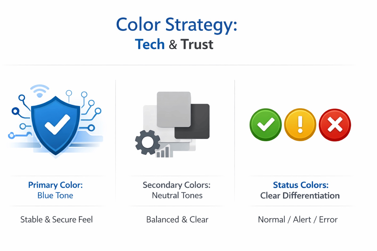
People read colour and icons first
We asked people who own this kind of product, with no technical background, to check a device's status, switch one on or off, and spot and deal with a problem. Three things kept coming up:
- 1
People judge status by colour and icon before reading anything.
- 2
Clear device groups make things faster to find.
- 3
A small animation on each switch makes people trust it worked.
App · Home
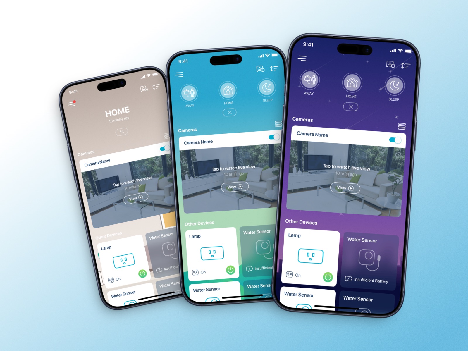
Know how your home is doing the moment you open it
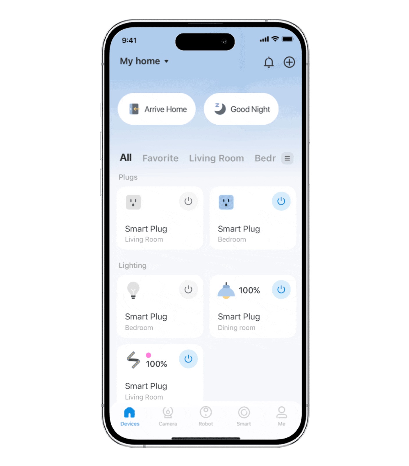
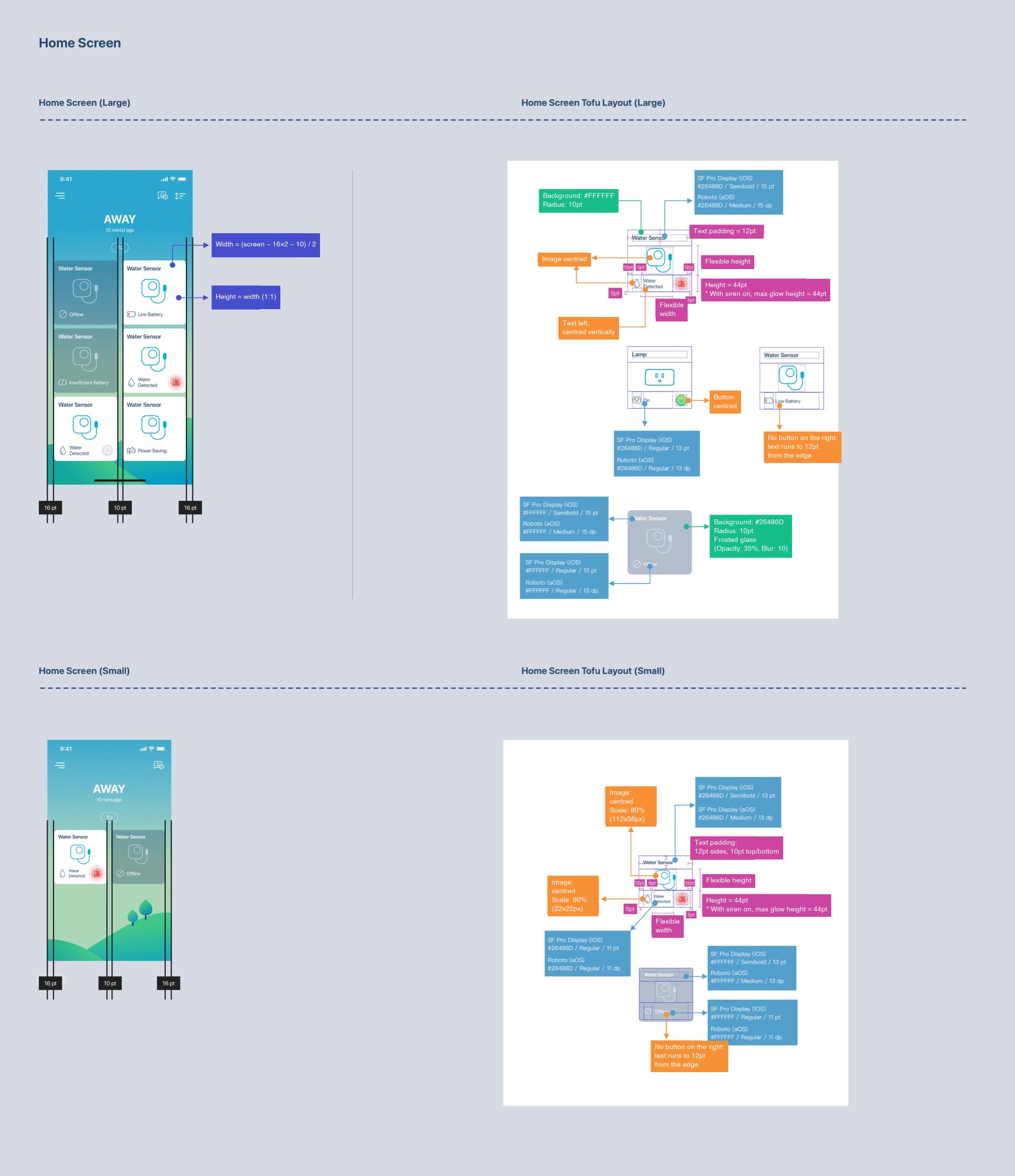
The home screen stopped being a list of devices. It comes in three themes, and reads top to bottom:
- 1
Scenes on top (Home, Away, Sleep): one tap changes the whole house.
- 2
The live camera view sits in the most visible spot.
- 3
Every other device uses the same states, shown with colour, icon and text.
App · Setup
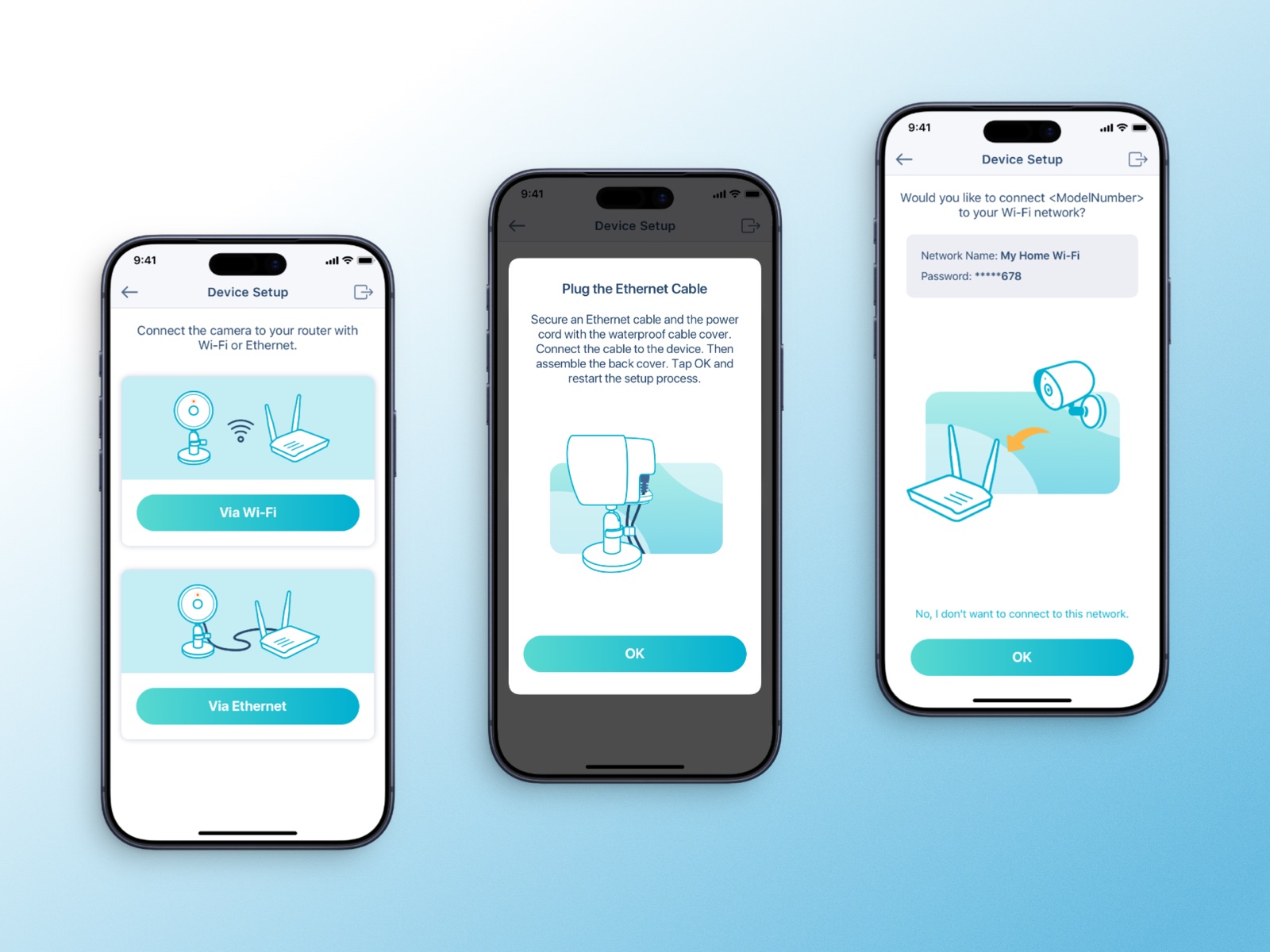
The app finds the device, not the user
Traditional setup sends people to find the device's own network, and many never find their way back. The app now finds the device over Bluetooth (BLE), then walks through Wi-Fi, naming and activation in one guided flow. People never need to know the network switched along the way.
App · Scenes & automation
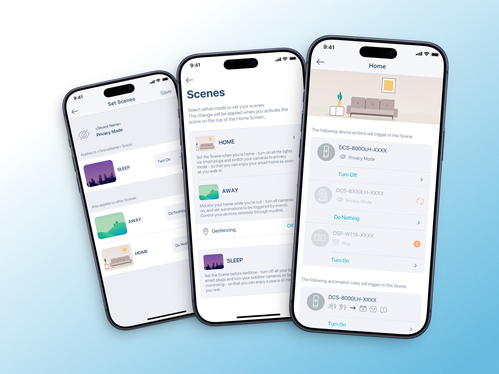
One tap, or no tap at all
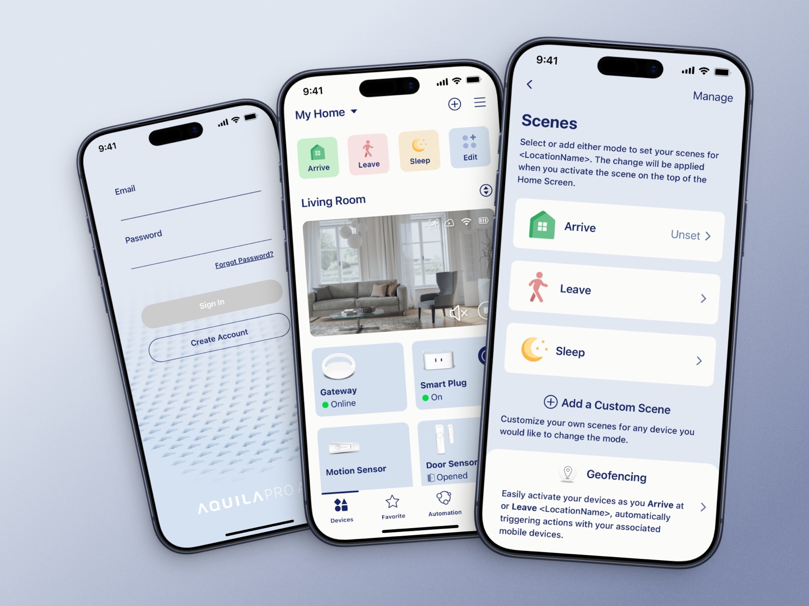
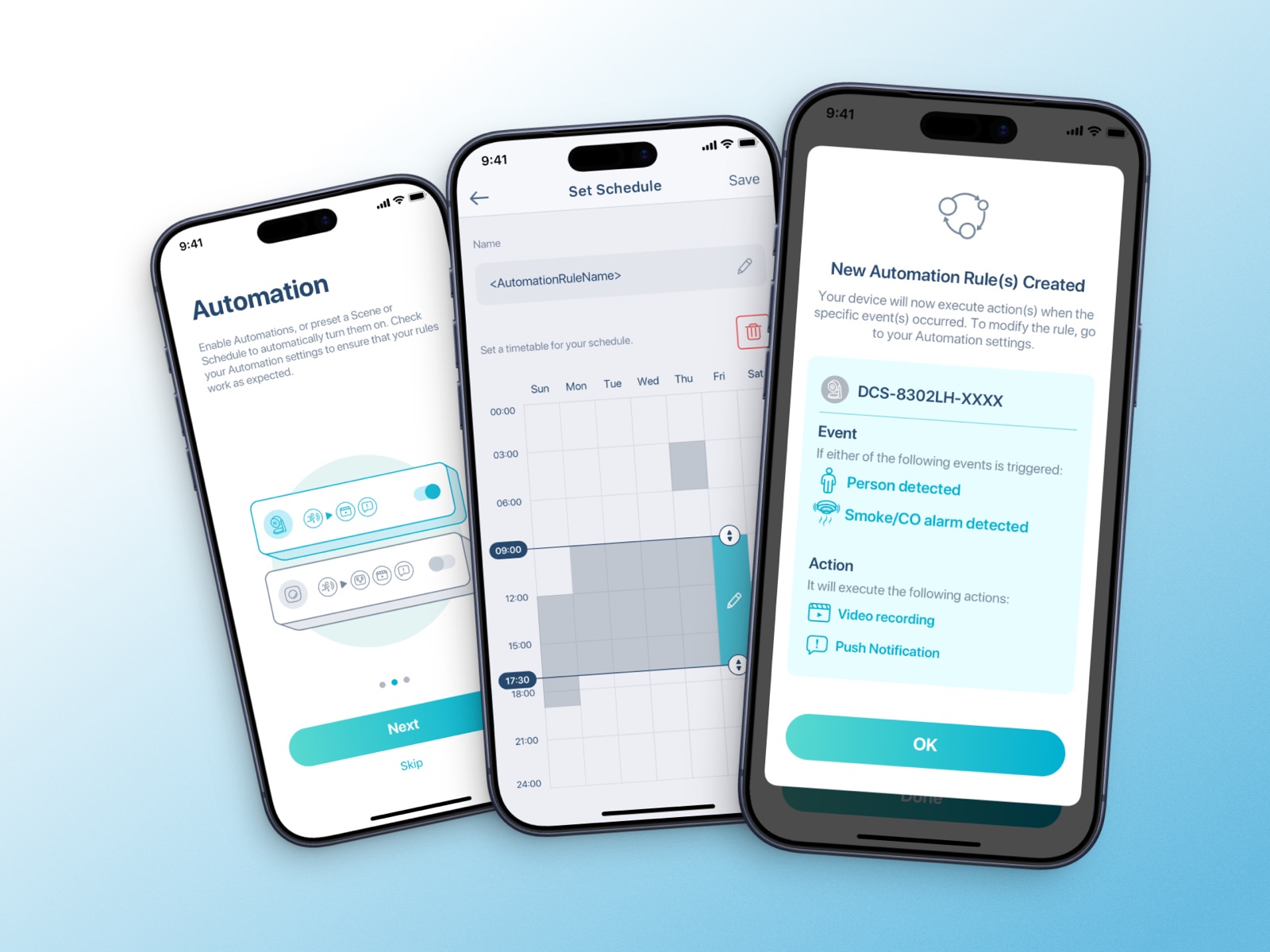
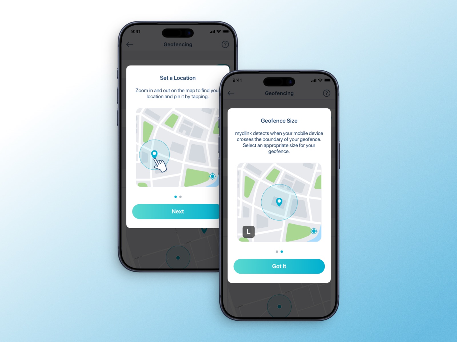
Scenes bundle several device actions into one tap. Automations run by time, event or location, and geofencing triggers them when you arrive or leave home.
App · Cloud recording
One plan on the first screen
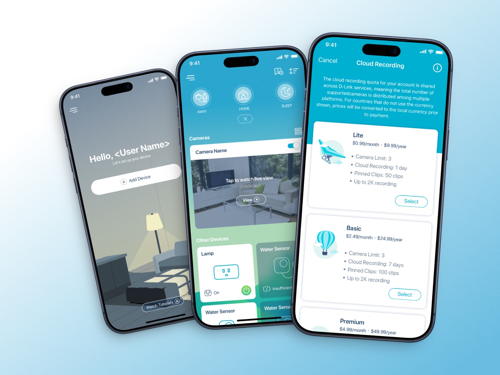
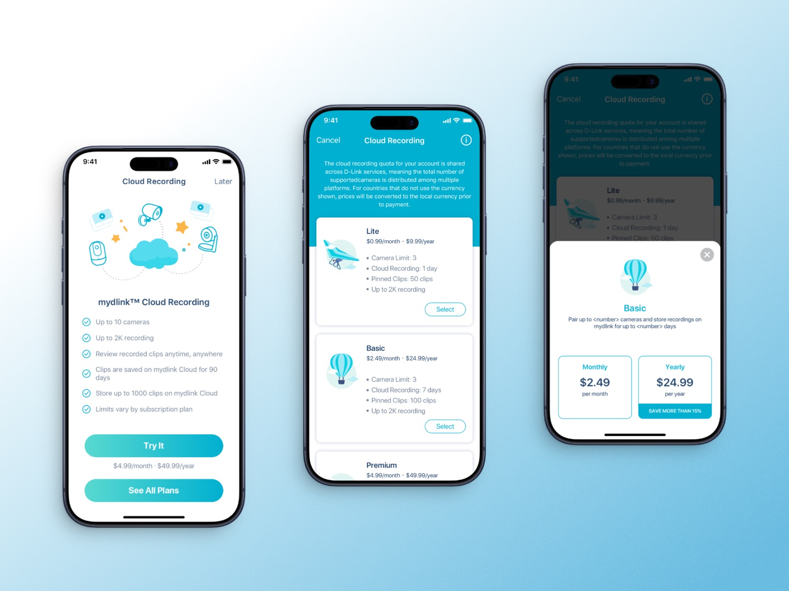
The payment flow went through several rounds of discussion, and the PM set the direction; we proposed the solutions. There are six plans, but the first screen shows one price and one main button:
- 6
- plans in total
- 1
- shown on the first screen
- 1
$4.99 a month and a Try It button. "See All Plans" sits underneath.
- 2
Choosing a plan and choosing monthly or yearly are separate steps. Only yearly carries the "save over 15%" tag.
- 3
The in-app list leaves out the free plan: anyone here is already thinking about paying.
App · Alerts
Deal with it from the lock screen
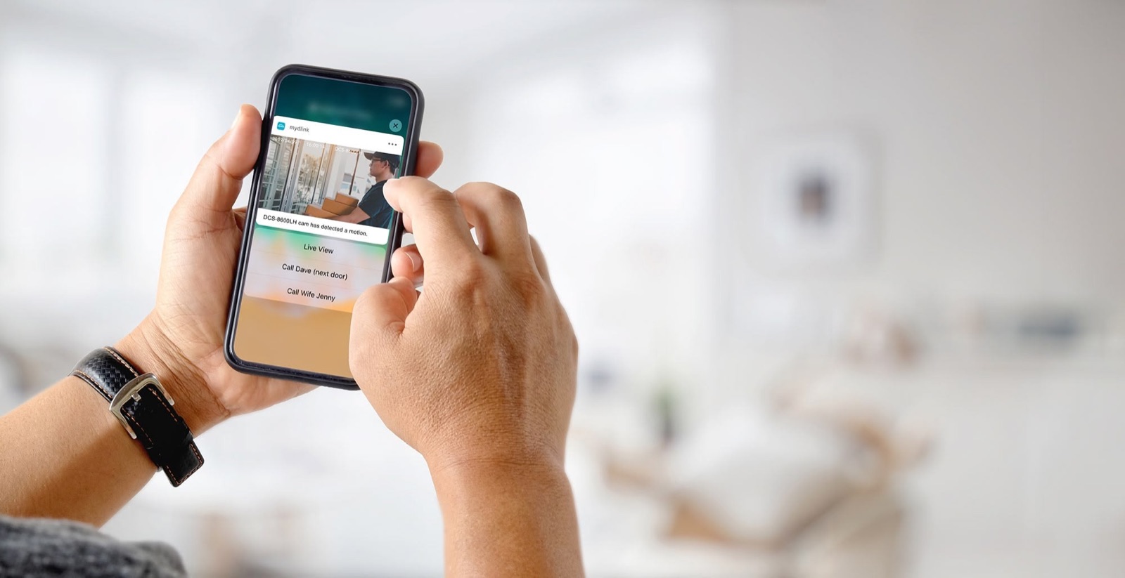
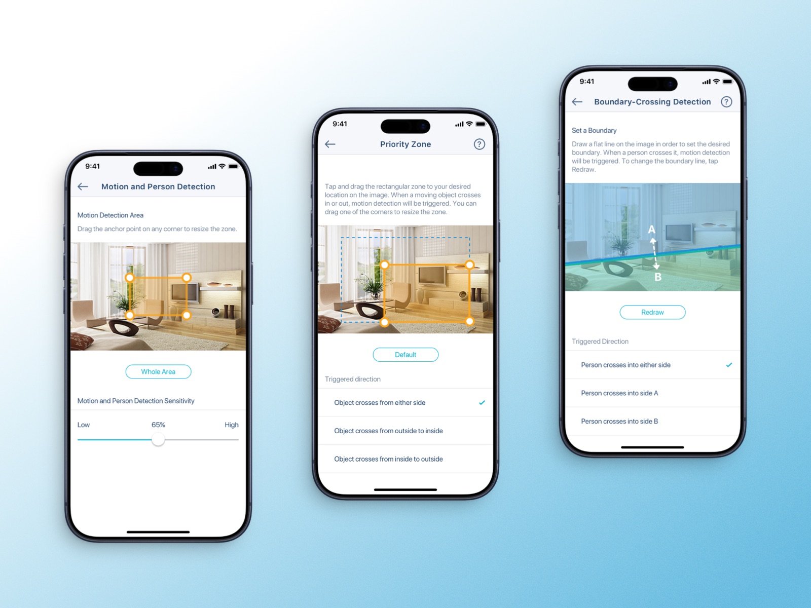
Notifications carry a thumbnail and action buttons, so you don't have to open the app. AI detection lets you draw the area you care about right on the camera view.
Web · Cameras
Two web versions, each with a way to the other
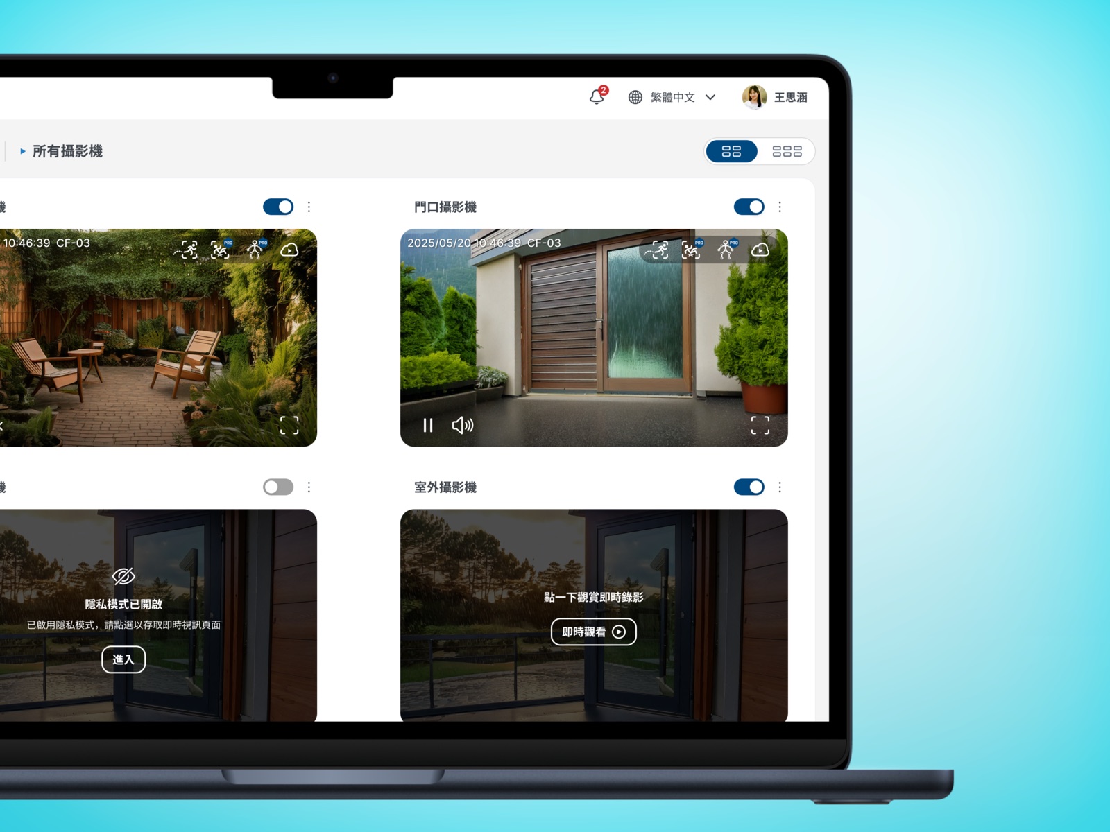
For a while the old and new web systems ran side by side. Some models only worked on the old one, and people had no idea which side they belonged to. So both sites carry a link to the other in the top bar, instead of leaving people to guess and fail to log in.
Design system
Only status gets to be loud
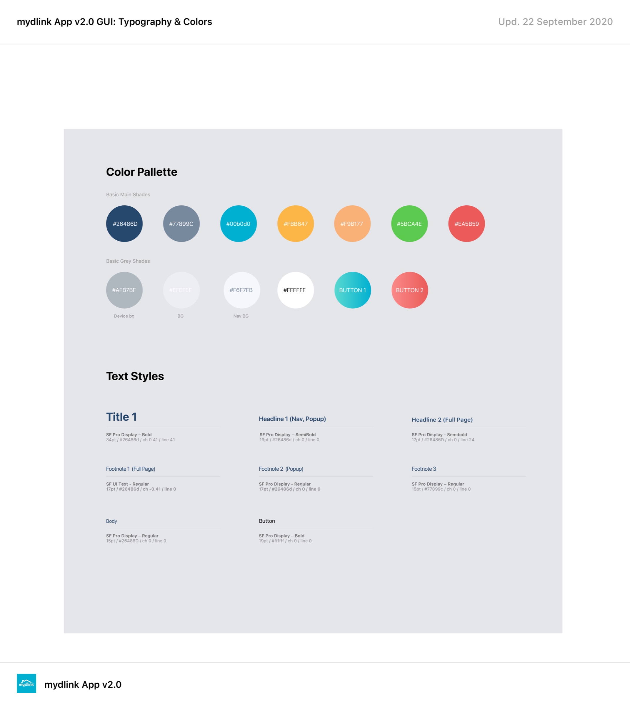
Neutral greys hold the layout, tech blue carries the brand, and status colours are the only saturated thing on screen, which is why a red dot means something. Every status uses colour, an icon and text together, and I adjusted the palette to pass WCAG AA contrast.
Influence
Beyond the project itself
Other teams built with the components. Engineers, PMs and other designers started pulling these components into their own work. A library gets adopted when using it is faster than going around it.
Reframing a colour argument around users. My manager wanted mydlink to share AQUILA's colours. Instead of arguing which palette looked better, I pointed out the two products are sold to different people: AQUILA buyers chose a router themselves, mydlink buyers just want a camera by the front door. In the end the two products kept one shared palette, and the colours were reworked for accessibility. I still use the move itself: when a decision is framed as taste, reframe it as who it's for.
D-Link's official tutorial videos were filmed on this interface:
Someone else's proof
Official tutorials filmed against the interface. Everything else on this page you have to take my word for — these you don't.
Looking back
The components lived on. The rules didn't.
- 1
I never set up a way to measure it, so there are no before-and-after numbers. What I can say: app-related support questions dropped, leaving mostly hardware issues, and sales demos got easier.
- 2
I handed over a Figma library and called it done: no written rules, no tokens agreed with engineering. When people moved on, it drifted apart. Now I write the rules and tokens before drawing a single component.
- 3
The research left qualitative notes, not completion rates. Next time I'd record those too.